SVG Hiveplot Python API
Project description
Pyveplot
A nice way of visualizing complex networks are Hiveplots.
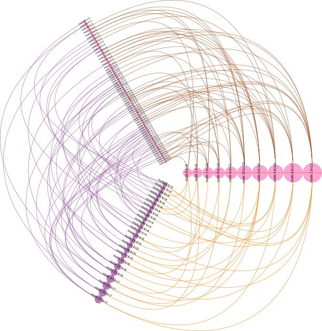
This library uses svgwrite to programmatically create images like the one bellow, a visualization of a Barabasi-Albert network, in which nodes are categorized by degree into high, medium and low.
Here's the code that generated the figure:
    from pyveplot import Hiveplot, Axis, Node
    import networkx as nx
    import random

    c = ['#e41a1c', '#377eb8', '#4daf4a',
         '#984ea3', '#ff7f00', '#ffff33',
         '#a65628', '#f781bf', '#999999',]

    # create hiveplot object
    h = Hiveplot()

    # create three axes, spaced at 120 degrees from each other
    h.axes = [Axis(start=20, angle=0,
                   stroke=random.choice(c), stroke_width=1.1),
              Axis(start=20, angle=120,
                   stroke=random.choice(c), stroke_width=1.1),
              Axis(start=20, angle=120 + 120,
                   stroke=random.choice(c), stroke_width=1.1)
              ]

    # create a random Barabasi-Albert network
    g = nx.barabasi_albert_graph(100, 2)

    # sort nodes by degree
    k = list(nx.degree(g))
    k.sort(key=lambda tup: tup[1])

    # categorize them as high, medium and low degree
    hi_deg = [v[0] for v in k if v[1] > 7]
    md_deg = [v[0] for v in k if v[1] > 3 and v[1] <= 7]
    lo_deg = [v[0] for v in k if v[1] <= 3]

    # place these nodes into our three axes
    for axis, nodes in zip(h.axes,
                           [hi_deg, md_deg, lo_deg]):
        circle_color = random.choice(c)
        for v in nodes:
            # create node object
            node = Node(radius=g.degree(v),
                        label="node %s k=%s" % (v, g.degree(v)))
            # add it to axis
            axis.add_node(v, node)
            # once it has x, y coordinates, add a circle
            node.add_circle(fill=circle_color, stroke=circle_color,
                            stroke_width=0.1, fill_opacity=0.7)
            if axis.angle < 180:
                orientation = -1
                scale = 0.6
            else:
                orientation = 1
                scale = 0.35
            # also add a label
            node.add_label("node %s k=%s" % (v, g.degree(v)),
                           angle=axis.angle + 90 * orientation,
                           scale=scale)

    # iterate through axes, from left to right
    for n in range(-1, len(h.axes) - 1):
        curve_color = random.choice(c)
        # draw curves between nodes connected by edges in network
        h.connect_axes(h.axes[n],
                       h.axes[n+1],
                       g.edges,
                       stroke_width=0.5,
                       stroke=curve_color)

    # save output
    h.save('ba_hiveplot.svg')
Installation
Install library::
$ pip install pyveplot
Project details
Download files
Download the file for your platform. If you're not sure which to choose, learn more about installing packages.
Source Distribution
Built Distribution
Filter files by name, interpreter, ABI, and platform.
If you're not sure about the file name format, learn more about wheel file names.
Copy a direct link to the current filters
File details
Details for the file pyveplot-1.0.2.tar.gz.
File metadata
- Download URL: pyveplot-1.0.2.tar.gz
- Upload date:
- Size: 5.0 kB
- Tags: Source
- Uploaded using Trusted Publishing? No
- Uploaded via: twine/3.1.1 pkginfo/1.5.0.1 requests/2.22.0 setuptools/42.0.2 requests-toolbelt/0.9.1 tqdm/4.40.2 CPython/3.6.9
File hashes
| Algorithm | Hash digest | |
|---|---|---|
| SHA256 |
3b60cb3703cb327615a69e192d96256808dfb5682e4e2f75b20f248661381a0c
|
|
| MD5 |
5aed5af1dc4de7601545866a4b2c3e88
|
|
| BLAKE2b-256 |
89163c2d67f0f3c1c8ebffca391ab60091cbf7486511d99b732b69db25df41c6
|
File details
Details for the file pyveplot-1.0.2-py3-none-any.whl.
File metadata
- Download URL: pyveplot-1.0.2-py3-none-any.whl
- Upload date:
- Size: 17.4 kB
- Tags: Python 3
- Uploaded using Trusted Publishing? No
- Uploaded via: twine/3.1.1 pkginfo/1.5.0.1 requests/2.22.0 setuptools/42.0.2 requests-toolbelt/0.9.1 tqdm/4.40.2 CPython/3.6.9
File hashes
| Algorithm | Hash digest | |
|---|---|---|
| SHA256 |
2c75ca289422ed296807d596107a29e1a91781c916a11d9167046dac7a7c023a
|
|
| MD5 |
bddd1160b9a27f49deca2753ba9b62f2
|
|
| BLAKE2b-256 |
cbb9b387c86fb6e8eed08ed9c83dc3a2200f1840838c911f1bfb229e7eafff3b
|


