A powerful, .exe Desktop Application Python GUI framework built on top of PySide6.

Project description


Image Examples
WinUp 🚀
A ridiculously Pythonic and powerful framework for building beautiful desktop applications.
WinUp is a modern UI framework for Python that wraps the power of PySide6 (Qt) in a simple, declarative, and developer-friendly API. It's designed to let you build applications faster, write cleaner code, and enjoy the development process.
Why WinUp? (Instead of raw PySide6 or Tkinter)
Desktop development in Python can feel clunky. WinUp was built to fix that.
| Feature | WinUp Way ✨ | Raw PySide6 / Tkinter Way 😟 |
|---|---|---|
| Layouts | ui.Column(children=[...]), ui.Row(children=[...]) |
QVBoxLayout(), QHBoxLayout(), layout.addWidget(), pack(), grid() |
| Styling | props={"background-color": "blue", "font-size": "16px"} |
Manual QSS strings, widget.setStyleSheet(...), complex style objects. |
| State Management | state.bind(widget, "prop", "key") |
Manual callback functions, getters/setters, StringVar(), boilerplate everywhere. |
| Two-Way Binding | state.bind_two_way(input_widget, "key") |
Non-existent. Requires manual on_change handlers to update state and UI. |
| Developer Tools | Built-in Hot Reloading, code profiler, and window tools out of the box. | Non-existent. Restart the entire app for every single UI change. |
| Code Structure | Reusable, self-contained components with @component. |
Often leads to large, monolithic classes or procedural scripts. |
In short, WinUp provides the "killer features" of modern web frameworks (like React or Vue) for the desktop, saving you time and letting you focus on what matters: your application's logic.
🧊 WinUp vs 🧱 PyEdifice (Reddit User Request)
| Feature | WinUp | PyEdifice |
|---|---|---|
| 🧱 Architecture | React-style + state | React-style + state |
| 🌐 Built-in Routing | ✅ Yes (Router(routes={...})) |
❌ No built-in routing |
| ♻️ Lifecycle Hooks | ✅ on_mount, on_unmount, etc. |
⚠️ Limited (did_mount, etc.) |
| 🎨 Theming / Styling System | ✅ Global & Scoped themes | ❌ Manual CSS injection |
| 🔲 Layout Options | ✅ Row, Column, Grid, Stack, Flexbox | ⚠️ Mostly Box & HBox/VBox |
| 🎞️ Animations | ✅ Built-in (fade, scale, etc.) | ❌ None built-in |
| 🔁 Hot Reloading (LHR) | ✅ Stable + fast (loadup dev) |
⚠️ Experimental, limited support |
| 📦 Packaging | ✅ With LoadUp (PyInstaller-based) | ❌ Must integrate PyInstaller manually |
| 🧩 Component Reusability | ✅ High, declarative | ✅ High |
| 🛠 Developer Tooling | ✅ DevTools planned, Inspector soon | ❌ None yet |
| 📱 Mobile Support | ❌ Not yet | ❌ Not supported |
| 🧠 Learning Curve | ✅ Easy for Python+React users | ✅ Easy but less tooling |
✅ = Built-in or robust
⚠️ = Partial or limited
❌ = Missing entirely
Core Features
- Declarative & Pythonic UI: Build complex layouts with simple
RowandColumnobjects instead of clunky box layouts. - Component-Based Architecture: Use the
@componentdecorator to create modular and reusable UI widgets from simple functions. - Powerful Styling System: Style your widgets with simple Python dictionaries using
props. Create global "CSS-like" classes withstyle.add_style_dict. - Full Application Shell: Build professional applications with a declarative API for
MenuBar,ToolBar,StatusBar, andSystemTrayIcon. - Asynchronous Task Runner: Run long-running operations in the background without freezing your UI using the simple
@tasks.rundecorator. - Performance by Default: Includes an opt-in
@memodecorator to cache component renders and prevent needless re-computation. - Advanced Extensibility:
- Widget Factory: Replace any default widget with your own custom implementation (e.g., C++ based) using
ui.register_widget(). - Multiple Windows: Create and manage multiple independent windows for complex applications like tool palettes or music players.
- Widget Factory: Replace any default widget with your own custom implementation (e.g., C++ based) using
- Reactive State Management:
- One-Way Binding: Automatically update your UI when your data changes with
state.bind(). - Two-Way Binding: Effortlessly sync input widgets with your state using
state.bind_two_way(). - Subscriptions: Trigger any function in response to state changes with
state.subscribe().
- One-Way Binding: Automatically update your UI when your data changes with
- Developer-Friendly Tooling:
- Hot Reloading: See your UI changes instantly without restarting your app.
- Profiler: Easily measure the performance of any function with the
@profiler.measure()decorator. - Window Tools: Center, flash, or manage your application window with ease.
- Built-in Routing: Easily create multi-page applications with an intuitive, state-driven router.
- Flexible Data Layer: Includes simple, consistent connectors for SQLite, PostgreSQL, MySQL, MongoDB, and Firebase.
Built-in Tools
WinUp comes with a set of pre-built tools to handle common application needs, such as interacting with the webcam or the filesystem.
Filesystem Tool
The winup.tools.filesystem module provides a simple, cross-platform API for common file operations.
from winup.tools import filesystem

# Create a directory
filesystem.create_dir("my_app_data")

# Write to a file
filesystem.write_file("my_app_data/config.txt", "Hello, World!")

# Read from a file
content = filesystem.read_file("my_app_data/config.txt") # "Hello, World!"

# Work with JSON
data = {"theme": "dark", "version": 1}
filesystem.write_json("my_app_data/settings.json", data)
settings = filesystem.read_json("my_app_data/settings.json")

# Check if a file exists
if filesystem.exists("my_app_data/settings.json"):
    print("Settings file found!")

# Clean up
filesystem.remove("my_app_data")
Camera Tool
The winup.tools.camera.Camera class makes it easy to capture images from the system's webcam. It requires opencv-python and numpy.
import winup
from winup import ui
from winup.tools.camera import Camera

@winup.component
def CameraView():
    # Create a label to display the camera feed
    image_label = ui.Label()

    def capture_and_display():
        try:
            # Initialize the camera
            cam = Camera()

            # Capture a single frame
            pixmap = cam.capture_frame() # Returns a QPixmap

            if pixmap:
                # Display the captured frame in the label
                image_label.set_pixmap(pixmap)

            # Clean up the camera resource
            cam.release()
        except IOError as e:
            image_label.set_text(f"Error: {e}")

    return ui.Column(children=[
        image_label,
        ui.Button("Capture Frame", on_click=capture_and_display)
    ])

# To run this, you would need a WinUp app instance.
# Example: winup.run(main_component_path="camera_demo:CameraView", title="Camera Demo")
Notifications Tool
The winup.tools.notifications module provides a simple way to send native system notifications.
send(title, message, urgency): Sends a notification.urgencycan be 'low', 'normal', or 'critical' (primarily for Linux).- On Windows, this will appear as a standard message box.
import winup
from winup import ui
from winup.tools import notifications

def App():
    def on_click():
        notifications.send(
            title="Hello from WinUp!",
            message="This is a native system notification.",
            urgency="normal"
        )

    return ui.Button("Send Notification", on_click=on_click)

# Example: winup.run(main_component_path="notify_demo:App", title="Notification Demo")
Graphing Widgets
WinUp includes a powerful and easy-to-use set of graphing widgets built on QtCharts. These widgets are designed to be stylish, animated, and seamlessly integrate with your application's theme. They all support dynamic data updates via a simple set_data() method.
Bar Chart
Use a BarChart to compare values across different categories.
import winup
from winup import ui
import random

def App():
    bar_data = {"Apples": 12, "Oranges": 25, "Bananas": 8}
    chart = ui.BarChart(data=bar_data, title="Fruit Distribution")

    def randomize_data():
        new_data = {k: random.randint(5, 30) for k in bar_data}
        chart.set_data(new_data)

    return ui.Column([chart, ui.Button("Randomize", on_click=randomize_data)])

# To run this, you would need a WinUp app instance.
# Example: winup.run(main_component_path="graph_demo:App", title="Bar Chart Demo")
Line Chart
A LineChart is perfect for showing trends over time or continuous data.
import winup
from winup import ui
import random

def App():
    line_data = {"Sales": [(2020, 100), (2021, 150), (2022, 130), (2023, 180)]}
    chart = ui.LineChart(data=line_data, title="Annual Sales")

    def randomize_data():
        new_data = {"Sales": [(y, random.randint(80, 200)) for y, _ in line_data["Sales"]]}
        chart.set_data(new_data)

    return ui.Column([chart, ui.Button("Randomize", on_click=randomize_data)])

# To run this, you would need a WinUp app instance.
# Example: winup.run(main_component_path="graph_demo:App", title="Line Chart Demo")
Pie Chart
Use a PieChart (rendered as a modern donut chart) to show the proportions of a whole.
import winup
from winup import ui
import random

def App():
    pie_data = {"Desktop": 60, "Mobile": 30, "Tablet": 10}
    chart = ui.PieChart(data=pie_data, title="Device Usage")

    def randomize_data():
        new_data = {k: random.randint(10, 80) for k in pie_data}
        chart.set_data(new_data)

    return ui.Column([chart, ui.Button("Randomize", on_click=randomize_data)])

# To run this, you would need a WinUp app instance.
# Example: winup.run(main_component_path="graph_demo:App", title="Pie Chart Demo")
Scatter Plot
A ScatterPlot is ideal for visualizing the relationship between two numerical variables.
import winup
from winup import ui
import random

def App():
    scatter_data = {"Measurements": [(1.1, 2.3), (1.9, 3.1), (3.2, 4.0), (4.5, 5.1)]}
    chart = ui.ScatterPlot(data=scatter_data, title="Height vs. Weight")

    def randomize_data():
        new_data = {"Measurements": [(random.uniform(1,5), random.uniform(2,6)) for _ in range(4)]}
        chart.set_data(new_data)

    return ui.Column([chart, ui.Button("Randomize", on_click=randomize_data)])

# To run this, you would need a WinUp app instance.
# Example: winup.run(main_component_path="graph_demo:App", title="Scatter Plot Demo")
Slider
The Slider widget provides a highly customizable slider control. You can control its range, step, initial value, and appearance.
min,max: The minimum and maximum values of the slider.step: The increment for each step of the slider.value: The initial value of the slider.track_color: The color of the slider's track (the groove).thumb_style: A dictionary of CSS-like properties to style the slider's handle (the thumb).
import winup
from winup import ui

def App():
    label = ui.Label("Slider Value: 50")

    def update_label(value):
        label.set_text(f"Slider Value: {value}")

    slider = ui.Slider(
        min=0,
        max=100,
        step=5,
        value=50,
        on_change=update_label,
        track_color="#a9def9",
        thumb_style={
            "background-color": "#1a73e8",
            "border-radius": "10px"
        }
    )

    return ui.Column([label, slider], props={"spacing": 10, "padding": "20px"})

# Example: winup.run(main_component_path="slider_demo:App", title="Slider Demo")
Advanced Widgets
WinUp also provides more complex, pre-built components for common UI patterns.
Dock Widget
The Dock widget allows you to create dockable toolbars or panels around a central content area, similar to IDEs or creative software.
position: Where to place the dock ('left', 'right', 'top', 'bottom').title: The title displayed on the dock's title bar.children: A list of widgets to place inside the dock area.
import winup
from winup import ui

def App():
    # The central widget can be any component
    central_widget = ui.Label("Main Content Area", props={"alignment": "AlignCenter"})

    # A dockable panel for the left side
    left_dock = ui.Dock(
        position='left',
        title="Tools",
        children=[
            ui.Column([
                ui.Button("Tool 1"),
                ui.Button("Tool 2"),
            ])
        ]
    )

    # A dockable panel for the bottom
    bottom_dock = ui.Dock(
        position='bottom',
        title="Logs",
        children=[ui.Textarea("Log messages will appear here...")]
    )

    return ui.Frame(
        children=[left_dock, bottom_dock, central_widget]
    )

# Example: winup.run(main_component_path="dock_demo:App", title="Dock Demo")
Carousel
The Carousel widget provides a swipeable, animated container for displaying pages or images.
animation_duration: Speed of the slide animation in milliseconds.
import winup
from winup import ui

def App():
    return ui.Carousel(
        children=[
            ui.Label("Page 1", props={"background-color": "#f0f0f0", "alignment": "AlignCenter", "height": 150}),
            ui.Label("Page 2", props={"background-color": "#e0e0e0", "alignment": "AlignCenter", "height": 150}),
            ui.Label("Page 3", props={"background-color": "#d0d0d0", "alignment": "AlignCenter", "height": 150}),
        ]
    )

# To run this, you would need a WinUp app instance.
# Example: winup.run(main_component_path="carousel_demo:App", title="Carousel Demo")
Expandable Panel
The ExpandablePanel is a container that can be collapsed or expanded by the user, useful for hiding and showing content.
import winup
from winup import ui

def App():
    return ui.ExpandablePanel(
        "Click to Expand",
        children=[
            ui.Column(props={"spacing": 10, "margin": "10px"}, children=[
                ui.Label("This content was hidden!"),
                ui.Input(props={"placeholder": "You can place any widget inside."})
            ])
        ]
    )

# To run this, you would need a WinUp app instance.
# Example: winup.run(main_component_path="expandable_demo:App", title="Expandable Panel Demo")
Installation
pip install winup
The watchdog library is required for the Hot Reloading feature.
winup init
This makes an app template ready for use, if LoadUp doesn't work, use PyInstaller instead.
Getting Started: Hello, WinUp!
Creating an application is as simple as defining a main component and running it.
# hello_world.py
import winup
from winup import ui

# The @component decorator is optional for the main component, but good practice.
@winup.component
def App():
    """This is our main application component."""
    return ui.Column(
        props={
            "alignment": "AlignCenter",
            "spacing": 20
        },
        children=[
            ui.Label("👋 Hello, WinUp!", props={"font-size": "24px"}),
            ui.Button("Click Me!", on_click=lambda: print("Button clicked!"))
        ]
    )

if __name__ == "__main__":
    winup.run(main_component_path="hello_world:App", title="My First WinUp App")
Core Concepts
UI & Layouts
WinUp abstracts away Qt's manual layout system. You build UIs by composing Row and Column components.
def App():
    return ui.Column(  # Arranges children vertically
        children=[
            ui.Label("Top"),
            ui.Row(    # Arranges children horizontally
                children=[
                    ui.Button("Left"),
                    ui.Button("Right")
                ],
                props={"spacing": 10}
            ),
            ui.Label("Bottom")
        ],
        props={"spacing": 15, "margin": "20px"}
    )
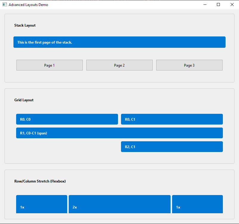
Advanced Layouts: Stack, Grid, and Stretch
Beyond simple Row and Column, WinUp provides more advanced layouts for building complex UIs.
1. Stack Layout
A Stack layout places its children on top of each other, like a deck of cards. Only one child is visible at a time. This is perfect for wizards, tab-less interfaces, or navigation with a RouterView.
def App():
    # The main stack layout
    main_stack = ui.Stack(children=[
        ui.Label("Page 1"),
        ui.Label("Page 2"),
    ])

    # Controls to switch between pages
    return ui.Column(children=[
        main_stack,
        ui.Row(children=[
            ui.Button("Show Page 1", on_click=lambda: main_stack.set_current_index(0)),
            ui.Button("Show Page 2", on_click=lambda: main_stack.set_current_index(1)),
        ])
    ])
2. Grid Layout
For form fields, dashboards, or calculator-style interfaces, the Grid layout is ideal. You specify children as tuples containing the widget and its grid position: (widget, row, col). You can also specify row and column spans: (widget, row, col, row_span, col_span).
def App():
    return ui.Grid(
        props={"spacing": 10},
        children=[
            # A 2x2 grid
            (ui.Button("Top-Left"), 0, 0),
            (ui.Button("Top-Right"), 0, 1),
            (ui.Button("Bottom-Left"), 1, 0),
            (ui.Button("Bottom-Right"), 1, 1),

            # A button spanning two columns
            (ui.Button("Full-Width Button"), 2, 0, 1, 2) # (widget, row, col, rowspan, colspan)
        ]
    )
3. Row & Column Stretching (Flexbox-like)
To create flexible UIs that adapt to window size, you can add a stretch factor to children of a Row or Column. This works like the flex-grow property in CSS. A child with a higher stretch factor will take up more available space.
In this example, the middle label (stretch: 2) will be twice as wide as the other two.
def App():
    return ui.Row(
        props={"spacing": 5},
        children=[
            (ui.Label("Takes up 1 part"), {"stretch": 1}),
            (ui.Label("Takes up 2 parts"), {"stretch": 2}),
            (ui.Label("Takes up 1 part"), {"stretch": 1}),
        ]
    )
Styling
You can style any widget by passing a props dictionary. Props can be CSS-like properties, or special keywords like class and id for use with a global stylesheet.
# Define global styles
winup.style.add_style_dict({
    ".btn-primary": {
        "background-color": "#007bff",
        "color": "white",
        "border-radius": "5px",
        "padding": "10px"
    },
    ".btn-primary:hover": {
        "background-color": "#0056b3"
    }
})

# Use the class in a component
def App():
    return ui.Button("Primary Button", props={"class": "btn-primary"})
Styling with an ID
For targeting a single, specific widget, you can use the id prop. This is equivalent to an ID in HTML/CSS and is the most specific selector. In your stylesheet, you target it with a # prefix.
# Add a style rule for a specific widget ID
winup.style.add_style_dict({
    "#special-button": {
        "border": "2px dashed #FF5722",
        "font-size": "16px"
    }
})

# Apply the ID to one specific instance
def App():
    return ui.Column(children=[
        ui.Button("Normal Button"),
        ui.Button("Special Button", props={"id": "special-button"})
    ])
Theming and Dynamic Styling
WinUp includes a powerful theming system that lets you define and switch between different looks for your application (e.g., light and dark mode) at runtime.
The system is built on a simple concept: theme variables. You define your application's stylesheet using variables (like $primary-color or $text-color). Then, you can define multiple "themes" that provide concrete values for these variables.
1. Using Theme Variables
You can use theme variables in two places:
- In a global stylesheet using
style.styler.add_style_dict(). - Directly in a widget's
propsdictionary.
# Define styles using variables
style.styler.add_style_dict({
    "QPushButton#action-button": {
        "background-color": "$primary-color",
        "color": "$primary-text-color",
        "font-weight": "bold",
    },
    "QLabel.title": {
        "color": "$text-color",
        "font-size": "24px",
    }
})

# Use variables directly in props
def App():
    return ui.Frame(
        props={"background-color": "$background-color"},
        children=[
            ui.Label("Hello Themed World!", props={"class": "title"}),
            ui.Button("Click Me", props={"id": "action-button"}),
        ]
    )
2. Switching Themes
WinUp comes with built-in light and dark themes. You can switch between them at any time using style.styler.themes.set_theme().
from winup import style

def toggle_theme():
    # Access the theme manager through the styler singleton
    current_theme = style.styler.themes._active_theme_name
    if current_theme == "light":
        style.styler.themes.set_theme("dark")
    else:
        style.styler.themes.set_theme("light")

# You can connect this function to a button click or a settings switch.
# The entire application will automatically restyle itself.
3. Creating Custom Themes
You can easily define your own themes by providing a dictionary of variable names to color values.
from winup import style

# Define a custom "matrix" theme
matrix_theme = {
    "primary-color": "#00FF41",
    "primary-text-color": "#000000",
    "background-color": "#0D0208",
    "text-color": "#00FF41",
    "border-color": "#008F11",
    "hover-color": "#00A62A",
}

# Add it to the theme manager via the styler
style.styler.themes.add_theme("matrix", matrix_theme)

# Now you can switch to it
style.styler.themes.set_theme("matrix")
Creating Reusable Components
While you can use raw ui elements everywhere, the best way to build a maintainable application is to create your own library of reusable components. WinUp provides two main ways to do this.
1. Styled Variants (Recommended)
This is the most common and powerful pattern. You can create a new, reusable component by wrapping a base widget with default props. This is perfect for creating a consistent design system (e.g., PrimaryButton, SecondaryButton, Card, Avatar).
The ui.create_component function is the key to this pattern.
# components.py
from winup import ui

# Create a PrimaryButton variant with default styles
PrimaryButton = ui.create_component(
    ui.Button,
    {
        "class": "btn-primary", # Target with global stylesheet
        "padding": "10px 15px",
        "font-weight": "bold",
    }
)

# Create an AlertLabel variant
AlertLabel = ui.create_component(
    ui.Label,
    {
        "background-color": "$error-color",
        "color": "$primary-text-color",
        "padding": "10px",
        "border-radius": "4px",
    }
)

# --- In your main application ---
# from components import PrimaryButton, AlertLabel

def App():
    return ui.Column(children=[
        PrimaryButton("Click me!"),
        # You can still override props at the instance level
        PrimaryButton("Cancel", props={"background-color": "$disabled-color"}),
        AlertLabel("Something went wrong!"),
    ])
2. Subclassing (For Advanced Behavior)
If you need to add new behavior to a widget (not just styles), you can fall back to standard Python subclassing. This is useful for creating highly specialized components with their own internal logic. After creating your class, you can register it with ui.register_widget to make it available everywhere.
from winup.ui.widgets.input import Input as DefaultInput

class PasswordInput(DefaultInput):
    """An Input that hides text by default but has a toggle button."""
    def __init__(self, props: dict = None):
        super().__init__(props=props)
        # In a real implementation, you would add a button here
        # and connect it to self.setEchoMode().
        self.setEchoMode(self.EchoMode.Password)

# In your main script, before winup.run():
# This makes `ui.PasswordInput()` available if you register it.
# ui.register_widget("PasswordInput", PasswordInput)
Traits System: Adding Behavior without Subclassing
While subclassing is great for creating new kinds of widgets, sometimes you just want to add a small, reusable piece of behavior to an existing widget—like making it draggable or giving it a right-click menu. This is where Traits come in.
Traits are modular behaviors that can be dynamically attached to any widget instance. WinUp comes with several built-in traits:
draggable&droptarget: A powerful, data-driven system for drag-and-drop functionality.context_menu: Adds a custom right-click context menu.tooltip: A simple way to add a hover tooltip.hover_effect: Applies a[hover="true"]style property on mouse-over, which you can target in your stylesheets (e.g.,QPushButton[hover="true"]).highlightable: Makes the text of a widget (likeui.Label) selectable by the user.
You can add a trait to any widget using winup.traits.add_trait().
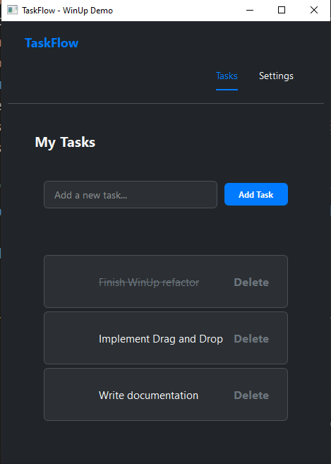
Example: Advanced Drag-and-Drop
The new drag-and-drop system is data-driven. You make a widget draggable and provide it with data. You make another widget a droptarget and tell it what kind of data it accepts and what to do on_drop.
# dnd_demo.py
import winup
from winup import ui, traits, state

def App():
    # Use state to manage the lists
    state.create("list_a", [{"id": 1, "text": "Item A"}])
    state.create("list_b", [{"id": 2, "text": "Item B"}])

    def move_item(source_list_key, target_list_key, item_id):
        # Find the item and move it between the state lists
        source_list = state.get(source_list_key)
        item_to_move = next((item for item in source_list if item["id"] == item_id), None)

        if item_to_move:
            new_source = [i for i in source_list if i["id"] != item_id]
            state.set(source_list_key, new_source)
            state.set(target_list_key, state.get(target_list_key) + [item_to_move])

    # A reusable component for our drop zones
    @winup.component
    def DropList(title, list_key, accepts_type):
        list_container = ui.Column(props={"spacing": 5, "min-height": "100px", "background-color": "#f0f0f0", "padding": "10px"})

        # 1. Make the container a drop target
        traits.add_trait(list_container, "droptarget",
            accepts=[accepts_type],
            on_drop=lambda data: move_item(data["source_list"], list_key, data["item_id"])
        )

        def render_list(items):
            winup.core.hot_reload.clear_layout(list_container.layout())
            for item in items:
                # 2. Make each item draggable
                draggable_widget = ui.Label(item["text"], props={"padding": "8px", "background-color": "white"})
                traits.add_trait(draggable_widget, "draggable",
                    data={"type": accepts_type, "item_id": item["id"], "source_list": list_key}
                )
                list_container.add_child(draggable_widget)

        state.subscribe(list_key, render_list)
        render_list(state.get(list_key))
        return ui.Column([ui.Label(title, props={"font-weight": "bold"}), list_container])

    return ui.Row(props={"spacing": 20, "margin": "20px"}, children=[
        DropList("List A (drag from here)", "list_a", "list-item"),
        DropList("List B (drop here)", "list_b", "list-item"),
    ])

if __name__ == "__main__":
    winup.run(main_component_path="dnd_demo:App", title="Drag and Drop Demo")
State Management: The Reactive Core
WinUp includes a powerful state management system that lets you create reactive UIs with minimal boilerplate. The new, recommended approach is object-oriented, making your code safer and more readable.
The New Way: state.create() and bind_to() (Recommended)
Instead of using string keys, you now create dedicated State objects. These objects are the single source of truth for your data and provide methods to interact with that data.
The real power comes from the bind_to() method, which can link one or more state objects to any widget property, using a simple function to format the final value.
1. Simple Counter Example
Here, we create a counter state object and bind it to a label's text property. The lambda function formats the output.
# new_state_demo.py
import winup
from winup import ui

def App():
    # 1. Create a state object with an initial value.
    counter = winup.state.create("counter", 0)

    # 2. Create the UI widgets.
    label = ui.Label()

    # 3. Bind the state to the label's 'text' property.
    # The lambda function will re-run whenever the counter changes.
    counter.bind_to(label, 'text', lambda c: f"Counter Value: {c}")

    def increment():
        # 4. Use the state object's methods to update the value.
        counter.set(counter.get() + 1)

    return ui.Column(children=[
        label,
        ui.Button("Increment", on_click=increment)
    ])

if __name__ == "__main__":
    winup.run(main_component_path="new_state_demo:App", title="New State Demo")
2. Multi-State Binding
Need a widget to react to changes in multiple state values? Use the and_() method to combine them. The formatter lambda will receive the state values as arguments in the same order.
def App():
    # Create two state objects
    first_name = winup.state.create("first_name", "John")
    last_name = winup.state.create("last_name", "Doe")

    greeting_label = ui.Label()

    # Bind the label's text to BOTH state objects
    first_name.and_(last_name).bind_to(
        greeting_label,
        'text',
        lambda fn, ln: f"Full Name: {fn} {ln}"
    )

    # ... widgets to change first_name and last_name
3. Two-Way Binding for Inputs
For the common case of syncing an Input widget with a state, the bind_two_way() helper is still available. It works directly with the state key.
email_input = ui.Input()
# The input's value updates the state, and the state updates the input's value.
winup.state.bind_two_way(email_input, 'email_value')
Legacy State Management (Old API)
For backward compatibility, the older, string-based API is still functional.
winup.state.set("key", value): Sets a value in the global store.winup.state.get("key"): Retrieves a value.winup.state.bind(widget, "property", "key"): A simple one-way binding to a widget's property.winup.state.subscribe("key", callback): Calls a function whenever a value changes.
# old_api_demo.py
winup.state.set("legacy_counter", 0)
label = ui.Label()
winup.state.bind(label, "text", "legacy_counter") # Binds to the text property

def increment():
    winup.state.set("legacy_counter", winup.state.get("legacy_counter") + 1)
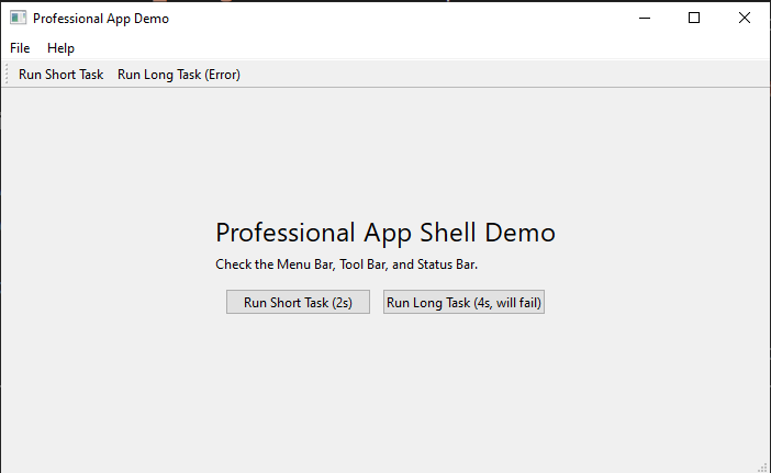
Asynchronous Task Runner (@tasks.run)
To keep your application responsive, any long-running operation (like a network request or a complex calculation) should be run on a background thread. WinUp makes this incredibly simple with the @tasks.run decorator.
It handles all the complex threading logic for you. You just need to provide callbacks for when the task starts, finishes, or encounters an error.
from winup import tasks, shell
import time

# These callbacks will be executed safely on the main GUI thread.
def on_task_start():
    shell.StatusBar.show_message("Processing...", -1) # Show message indefinitely

def on_task_finish(result):
    print(f"Task finished with result: {result}")
    shell.StatusBar.show_message(f"Success: {result}", 5000) # Show for 5s

def on_task_error(error_details):
    exception, traceback_str = error_details
    print(f"Task failed: {exception}")
    shell.StatusBar.show_message(f"Error: {exception}", 5000)

# Decorate your long-running function
@tasks.run(on_start=on_task_start, on_finish=on_task_finish, on_error=on_task_error)
def fetch_data_from_server(url: str):
    """This function runs on a background thread."""
    print("Fetching data...")
    time.sleep(3) # Simulate a network request
    if "error" in url:
        raise ConnectionError("Could not connect to server.")
    return "Data fetched successfully!"

# In your UI, just call the function as you normally would.
# WinUp will automatically delegate it to the background thread pool.
def App():
    return ui.Row(children=[
        ui.Button("Fetch Data", on_click=lambda: fetch_data_from_server("my-api.com/data")),
        ui.Button("Trigger Error", on_click=lambda: fetch_data_from_server("my-api.com/error")),
    ])
The decorator accepts three optional callback arguments:
on_start: A function to call right before the task begins executing.on_finish: A function that will receive the return value of your function if it completes successfully.on_error: A function that will receive a(exception, traceback)tuple if your function raises an exception.
Developer Tools
Hot Reloading (React-style Fast Refresh):
WinUp now features a fully automatic, intelligent hot reloading system. Simply run your application with dev=True, and the framework will automatically watch all of your project's Python files for changes.
When you save a file, WinUp will instantly reload the relevant parts of your code and re-render your UI without restarting the entire application, preserving your application's state. This provides a seamless development experience similar to modern web frameworks.
How to Use:
Just pass the dev=True flag to the run function. That's it!
# my_app.py
import winup
from winup import ui

@winup.component
def App():
    # Change this text, save the file, and see the UI update instantly.
    return ui.Label("Hello, Hot Reloading!")

if __name__ == "__main__":
    # Run in development mode to enable hot reloading.
    winup.run(main_component_path="my_app:App", title="Hot Reload Demo", dev=True)
This setup allows you to see UI changes instantly just by saving any file in your project.
Performance & Memoization:
For UIs that render large amounts of data, you can significantly improve performance by caching component results. The @winup.memo decorator automatically caches the widget created by a component. If the component is called again with the same arguments, the cached widget is returned instantly instead of being re-created.
import winup
from winup import ui

# By adding @winup.memo, this component will only be re-created
# if the 'color' argument changes.
@winup.memo
def ColorBlock(color: str):
    return ui.Frame(props={"background-color": color, "min-height": "20px"})

def App():
    # In this list, ColorBlock('#AABBCC') will only be called once.
    # The framework will then reuse the cached widget for the other two instances.
    return ui.Column(children=[
        ColorBlock(color="#AABBCC"),
        ColorBlock(color="#EEEEEE"),
        ColorBlock(color="#AABBCC"),
        ColorBlock(color="#AABBCC"),
    ])
Profiler:
Simply add the @profiler.measure() decorator to any function to measure its execution time. Results are printed to the console when the application closes.
The profiler also automatically tracks the performance of the memoization cache, showing you hits, misses, and the overall hit ratio.
from winup.tools import profiler

@profiler.measure
def some_expensive_function():
    # ... code to measure ...
    import time
    time.sleep(1)
Built-in Routing: Creating Multi-Page Applications
WinUp includes a simple yet powerful router that allows you to build applications with multiple pages or views, like a settings screen, a user dashboard, or different application tabs.
The system is built around three core concepts:
Router: An object that holds your application's routes (a mapping of a path like"/home"to a component function) and manages the current state.RouterView: A special component that acts as a placeholder. It automatically displays the correct component for the current route.RouterLink: A clickable component (like a hyperlink) that tells theRouterto navigate to a different path.
Example: A Simple Multi-Page App
Here's how you can structure a basic application with a "Home" and "Settings" page.
# multi_page_app.py
import winup
from winup import ui
from winup.router import Router, RouterView, RouterLink

# 1. Define your page components
@winup.component
def HomePage():
    return ui.Label("Welcome to the Home Page!", props={"font-size": "18px"})

@winup.component
def SettingsPage():
    return ui.Column(children=[
        ui.Label("Settings", props={"font-size": "18px"}),
        ui.Switch(text="Enable Dark Mode")
    ])

# 2. Create a router instance with your routes
app_router = Router({
    "/": HomePage,
    "/settings": SettingsPage,
})

# 3. Build the main application layout
def App():
    return ui.Column(
        props={"spacing": 15, "margin": "10px"},
        children=[
            # Navigation links
            ui.Row(
                props={"spacing": 20},
                children=[
                    RouterLink(router=app_router, to="/", text="Home"),
                    RouterLink(router=app_router, to="/settings", text="Settings")
                ]
            ),
            # The RouterView will render either HomePage or SettingsPage
            ui.Frame(
                props={"border": "1px solid #ccc", "padding": "10px"},
                children=[
                    RouterView(router=app_router)
                ]
            )
        ]
    )

if __name__ == "__main__":
    # You need to create the router files first for this to work.
    winup.run(main_component_path="multi_page_app:App", title="Multi-Page App Demo")
Nested Routing and Layouts
For more complex applications, you often need nested views (e.g., an "Account" section with its own sub-navigation for "Profile" and "Billing"). The router supports this through a layout-based approach.
Instead of nesting RouterView components, the recommended pattern is to create a layout component that accepts a child_view function as a prop. Each route then renders the layout component, passing in the specific child page it should display.
This approach is more explicit, easier to reason about, and avoids potential recursion issues.
# nested_routing_app.py
import winup
from winup import ui
from winup.router import Router, RouterView, RouterLink
from typing import Callable

# 1. Define the pages
@winup.component
def DetailsPage():
    return ui.Label("Your account details.")

@winup.component
def BillingPage():
    return ui.Label("Your billing information.")

# 2. Create the shared layout component
@winup.component
def AccountLayout(router: Router, child_view: Callable):
    """A layout that contains sub-navigation and renders a child view."""
    return ui.Column(props={"spacing": 10}, children=[
        ui.Label("Account Settings", props={"font-weight": "bold"}),
        ui.Row(children=[
            RouterLink(router, "/account/details", "Details"),
            RouterLink(router, "/account/billing", "Billing"),
        ]),
        # Render the specific child page here
        ui.Frame(props={"border": "1px solid #eee", "padding": "10px"}, children=[
            child_view()
        ])
    ])

# 3. Define the routes using the layout
app_router = Router({
    # Each route renders the layout with a different child
    "/account/details": lambda: AccountLayout(router=app_router, child_view=DetailsPage),
    "/account/billing": lambda: AccountLayout(router=app_router, child_view=BillingPage),
    # Add a redirect for the base path
    "/account": {"redirect": "/account/details"},
})
Component Lifecycle Hooks: on_mount and on_unmount
To manage side effects—like fetching data, setting up timers, or starting animations—WinUp components now have lifecycle hooks. These are special functions you can pass to a component that run at specific times.
on_mount: This function is called exactly once, right after the component's UI has been created and added to the scene (i.e., it has "mounted"). It's the perfect place to load data or start animations.on_unmount: This function is called exactly once, just before the component is destroyed and removed from the scene. It's essential for cleanup tasks, like canceling network requests, invalidating timers, or saving state.
Example: A Self-Updating Clock
This example demonstrates how to use on_mount to start a timer and on_unmount to clean it up, preventing memory leaks.
# lifecycle_demo.py
import winup
from winup import ui, state
from PySide6.QtCore import QTimer

@winup.component
def Clock():
    # 1. A state to hold the current time string
    time_state = state.create("current_time", "Loading...")

    # 2. A variable to hold our QTimer instance
    timer = None

    def update_time():
        # This function will be called by the timer
        import datetime
        now = datetime.datetime.now()
        time_state.set(now.strftime("%H:%M:%S"))

    def on_mount():
        nonlocal timer
        print("Clock Mounted: Starting timer.")
        # Create and start the timer when the component appears
        timer = QTimer()
        timer.timeout.connect(update_time)
        timer.start(1000) # Update every 1000 ms (1 second)
        update_time() # Initial update

    def on_unmount():
        nonlocal timer
        print("Clock Unmounted: Stopping timer.")
        # Stop the timer when the component disappears to avoid errors
        if timer:
            timer.stop()
            timer = None

    # 3. Create a label and bind its text to our state
    time_label = ui.Label()
    time_state.bind_to(time_label, 'text', lambda t: f"Current Time: {t}")

    # 4. Pass the hooks to the component container
    return ui.Frame(
        children=[time_label],
        on_mount=on_mount,
        on_unmount=on_unmount
    )

# A simple app to show/hide the clock to test the hooks
def App():
    visibility_state = state.create("clock_visible", True)

    def toggle_clock():
        visibility_state.set(not visibility_state.get())

    placeholder = ui.Frame(props={"min-height": "50px"})

    def on_visibility_change(is_visible):
        clear_layout(placeholder.layout())
        if is_visible:
            placeholder.add_child(Clock())
        else:
            placeholder.add_child(ui.Label("Clock is hidden."))

    visibility_state.subscribe(on_visibility_change)
    on_visibility_change(visibility_state.get()) # Initial render

    return ui.Column(children=[
        ui.Button("Toggle Clock", on_click=toggle_clock),
        placeholder
    ])

if __name__ == "__main__":
    # You will need to import clear_layout from winup.core.hot_reload
    from winup.core.hot_reload import clear_layout
    winup.run(main_component_path="lifecycle_demo:App", title="Lifecycle Demo")
Built-in Animations & Effects
WinUp provides a simple API for creating smooth animations, located in the winup.animate.fx module. You can easily fade widgets in and out or animate any of their properties.
Example: Fading and Moving
This example shows how to use fade_in, fade_out, and the generic animate function to move a widget.
# animation_demo.py
import winup
from winup import ui
from winup.animate import fx # Import the animation functions
from PySide6.QtCore import QRect

def App():

    animated_label = ui.Label(
        "Animate Me!",
        props={"padding": "20px", "background-color": "#ADD8E6"}
    )

    def slide_in():
        # Animate the widget's geometry (position and size)
        start_rect = animated_label.geometry()
        end_rect = QRect(20, 20, start_rect.width(), start_rect.height())
        fx.animate(animated_label, b"geometry", end_rect, 500)

    # Place the label in a container with a null layout for manual positioning
    container = ui.Frame(
        props={"layout": "null"},
        children=[animated_label]
    )

    # Start the label faded out
    fx.fade_out(animated_label, duration=0)

    return ui.Column(props={"margin":"20px", "spacing": 10}, children=[
        container,
        ui.Row(props={"spacing": 10}, children=[
            ui.Button("Fade In", on_click=lambda: fx.fade_in(animated_label, 300)),
            ui.Button("Fade Out", on_click=lambda: fx.fade_out(animated_label, 300)),
            ui.Button("Slide In", on_click=slide_in),
        ])
    ])

if __name__ == "__main__":
    winup.run(main_component_path="animation_demo:App", title="Animation Demo")
Hot Reloading for Development
WinUp includes a powerful hot-reloading feature to accelerate development. When enabled, any changes you make to your component files will be reflected instantly in your running application without needing a manual restart.
How it Works
The hot-reloading service monitors your project's Python files. When a change is detected, it intelligently reloads the necessary modules and redraws the UI, preserving the application's state. This is ideal for iterating quickly on UI design and component logic.
Enabling Hot Reload
To enable hot reloading, you must run your application in development mode. This is done by passing dev=True to the winup.run() function.
You also need to provide the main component as a string path in the format "path.to.module:ComponentName". This allows WinUp to dynamically re-import your component when the source file changes.
Example
Here is how you would structure your main application script to use hot reloading:
# main.py
import winup
import sys
import os

# Assume 'my_app' is your components package
from my_app.my_component import App

if __name__ == "__main__":
    # Add the project root to the path to ensure modules can be found
    project_root = os.path.abspath(os.path.dirname(__file__))
    if project_root not in sys.path:
        sys.path.insert(0, project_root)

    # Run the app with hot reloading enabled
    winup.run(
        main_component_path="my_app.my_component:App",
        title="My App with Hot Reload",
        dev=True
    )
Now, when you run python main.py, any changes you make to my_app/my_component.py (or any other component file) will be reflected instantly.
Contributing
WinUp is an open-source project. Contributions are welcome!
License
This project is licensed under the MIT License. See LICENSE for more information.
Release history Release notifications | RSS feed


Download files
Download the file for your platform. If you're not sure which to choose, learn more about installing packages.
Source Distribution
Built Distribution
Filter files by name, interpreter, ABI, and platform.
If you're not sure about the file name format, learn more about wheel file names.
Copy a direct link to the current filters
File details
Details for the file winup-2.4.5.tar.gz.
File metadata
- Download URL: winup-2.4.5.tar.gz
- Upload date:
- Size: 96.5 kB
- Tags: Source
- Uploaded using Trusted Publishing? No
- Uploaded via: twine/6.1.0 CPython/3.13.5
File hashes
| Algorithm | Hash digest | |
|---|---|---|
| SHA256 |
4047ef1ff05d12f786cfa9dfe1f79481a4e49b41c266ec722e22ce0699384fbb
|
|
| MD5 |
6ba4cb4167024a43ae254c51732a7bf8
|
|
| BLAKE2b-256 |
497c137ef5750fdc282c66a2417ee577d2d769c3e59a1bac6db14a2c62339793
|
File details
Details for the file winup-2.4.5-py3-none-any.whl.
File metadata
- Download URL: winup-2.4.5-py3-none-any.whl
- Upload date:
- Size: 87.6 kB
- Tags: Python 3
- Uploaded using Trusted Publishing? No
- Uploaded via: twine/6.1.0 CPython/3.13.5
File hashes
| Algorithm | Hash digest | |
|---|---|---|
| SHA256 |
033b0a21141432c9b2b98c9ab256990b75e03aa1ea0b5b1382738256f5ccafe9
|
|
| MD5 |
1f85b4979be89098ea272f9fa4719dc0
|
|
| BLAKE2b-256 |
f69181b9e675d01ecb8e49df2b8aa304a945d8d3ff1b69c81e75cfb73d137cc4
|


