
CanvasXpress for Python

CanvasXpress is a comprehensive visualization library developed by Dr. Isaac Neuhaus for bioinformatics and systems biology analysis at Bristol-Myers Squibb. It supports more than 30 chart types to display scientific and non-scientific data, with a sophisticated user interface for exploring complex datasets, reproducible research auditing, and broadcasting capabilities to synchronize data points across plots.
The CanvasXpress Python package is maintained by Dr. Todd C. Brett, with support from Aggregate Genius Inc.. Dr. Constance Brett leads the R library development, while Dr. Isaac Neuhaus maintains the original JavaScript library along with the PHP and R implementations.
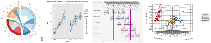
CanvasXpress can be used for native Python integration for the following environments:
The RStudio IDE Viewer is also used when running code chunks in Jupyter, Quarto, and RMD Python code chunks.
Project Status







Documentation and Installation
Documentation
Documentation is maintained on this page and at CanvasXpress.org and LinkedIn:
Installation
CanvasXpress for Python can be installed using pip:
The essential CanvasXpress package, for use with the CLI or flask and similar environments, can be installed using:
pip install canvasxpress
or
pip install "canvasxpress[core]"
In addition to core, the following additional targets can be used:
- jupyter - installs additional packages to support rendering in Jupyter, Quarto, and IPython documents
- dash - installs additional packages to support rendering in Plotly Dash applications
- streamlit - installs additional packages to support rendering in Snowflake Streamlit applications
- shiny - installs additional packages to support rendering in Posit Shiny for Python applications
- rstudio - installs additional packages to support rendering in the Posit RStudio IDE Viewer, plus includes the same packages for jupyter and shiny
- all - installs all additional packages to support rendering in any supported document or application
CanvasXpress AI Skills
The CanvasXpress Python package includes built-in AI agent skills (canvasxpress_charts) that enable coding assistants (Claude, Cursor, OpenCode, Qwen, and other LLM-based tools) to generate production-ready visualization code. Upon installation, the skills are automatically distributed to standard agent directories:
What the skills can do
- Generate charts from natural language — Describe your data and desired visualization in plain English; the agent produces complete, validated CanvasXpress Python code
- Convert from Plotly/Matplotlib — Paste existing Plotly or Matplotlib code and get the CanvasXpress equivalent with proper data reshaping
- Multi-chart dashboards — Create coordinated dashboards with automatic broadcasting, where clicking data points in one chart highlights corresponding points in others
- Advanced metadata visualizations — Build heatmaps with sample/variable annotations, DOTplots with overlays, network graphs, Venn diagrams, and more
- Interactive charts with events — Add click handlers, hover tooltips, selection callbacks, and Shiny/Streamlit integrations using
canvasxpress_events - Highlighting & storytelling — Create charts that emphasize specific data points using ghost/focus modes, predicates, and custom emphasis colors
- Custom styling — Control colors, fonts, dimensions, orientations, and chart-type-specific styling
- Export to images/JSON — Convert charts to PNG, PDF, or reproducible JSON for sharing and archival
- Jupyter notebook creation — Generate complete Jupyter notebooks with CanvasXpress charts using
canvasxpress_notebooks - Code validation — Validate generated code for syntax correctness using
canvasxpress_validator - Frame work-agnostic rendering — Works in Jupyter, Dash, Shiny, Streamlit, Flask, and plain Python scripts
Example Prompts
Use these as inspiration for prompts you can give to your AI coding assistant:
Simple Charts
Prompt: "Create a vertical bar chart showing monthly sales (Jan-May: 120, 150, 180, 200, 250). Title it 'Monthly Sales', label axes, and make it 600x500 pixels."
Prompt: "Generate a horizontal bar chart comparing Var 1 and Var 2 across five categories (Cat 1–Cat 5). Show data values inside each bar in white text. Title: 'Bar Graph Showing Data Values'."
Heatmaps & Annotations
Prompt: "Create a heatmap of gene expression data with 3 genes (GeneA, GeneB, GeneC) and 3 samples (Sample1, Sample3). Add sample annotations: Treatment (Control/Treatment) and Batch (A/B). Use a diverging color scheme and show the annotation legend."
Prompt: "Build a dose-response heatmap showing treatment effects across Sites 1–3 and Doses 0–25. Include sample annotations for Dose, Site, and Treatment. Use navy-white-firebrick color spectrum."
Scatter Plots & Highlighting
Prompt: "Create a scatter plot of Height vs Weight with 6 individuals (Keith, Nina, Freddy, Tracey, Isabelle, Penny). Add a regression line, highlight Freddy and Isabelle in blue using focus mode, and add histograms on the margins."
Prompt: "Generate a scatter plot comparing Age vs Response with 50 data points. Highlight all points where Age > 40 using predicate-based highlighting. Add axis labels, title, and a blue color scheme."
Multi-Chart Dashboards
Prompt: "Create a dashboard with three coordinated charts: a scatter plot (Height vs Weight), a bar chart (Age by Gender), and a heatmap (Measurements). Clicking a data point in any chart should highlight corresponding data in all others via automatic broadcasting."
Prompt: "Build a DOE dashboard using a bar chart with metadata (Height, Weight, Gender, Exercise) that filters all other charts on the page when users interact with the pie charts and histograms."
Conversions
Prompt: "Convert this Plotly code to CanvasXpress: go.Figure(data=go.Bar(x=['A','B','C'], y=[10,20,30])) with title 'My Chart'."
Prompt: "Translate this Matplotlib scatter plot to CanvasXpress: plt.scatter(heights, weights) with xlabel 'Height', ylabel 'Weight'."
Advanced & Specialty Charts
Prompt: "Create a Venn diagram with 3 sets (List1: 340, List2: 562, List3: 620) and their pairwise and triple intersections. Include custom legend labels."
Prompt: "Build a network graph with 5 nodes and 7 edges. Color nodes by metadata category, label nodes, and use force-directed layout. Title: 'Interaction Network'."
Prompt: "Generate a bullet chart comparing actual vs target performance (V1 actual, V5 target) across 6 samples. Use range colors for performance zones and show data values inside bars."
Installation
Install the package using pip or uv:
pip install canvasxpress
or
uv add canvasxpress
The skills are automatically installed during package setup to:
~/.agents/skills/canvasxpress_charts/SKILL.md~/.agents/skills/canvasxpress_events/SKILL.md~/.agents/skills/canvasxpress_notebooks/SKILL.md~/.agents/skills/canvasxpress_validator/SKILL.md~/.config/opencode/skills/canvasxpress_charts/SKILL.md~/.config/opencode/skills/canvasxpress_events/SKILL.md~/.config/opencode/skills/canvasxpress_notebooks/SKILL.md~/.config/opencode/skills/canvasxpress_validator/SKILL.md~/.claude/skills/canvasxpress_charts/SKILL.md~/.claude/skills/canvasxpress_events/SKILL.md~/.claude/skills/canvasxpress_notebooks/SKILL.md~/.claude/skills/canvasxpress_validator/SKILL.md
After installation, restart your AI coding agent to activate the skills.
Manual Reinstallation
To manually reinstall or update the skills, use the CanvasXpress CLI:
canvasxpress --force
Available targets: opencode, claude, agents, all (default), or both (opencode + agents).
For detailed documentation on each skill, refer to the respective SKILL.md files in your agent's skill directory.
Rendering Framework Profiles
CanvasXpress supports multiple rendering frameworks. Install the package with the appropriate profile for your use case:
# For Jupyter notebooks:
pip install "canvasxpress[jupyter]"
uv add "canvasxpress[jupyter]"

# For Plotly Dash apps:
pip install "canvasxpress[dash]"
uv add "canvasxpress[dash]"

# For Streamlit apps:
pip install "canvasxpress[streamlit]"
uv add "canvasxpress[streamlit]"

# For Shiny for Python apps:
pip install "canvasxpress[shiny]"
uv add "canvasxpress[shiny]"

# For RStudio IDE:
pip install "canvasxpress[rstudio]"
uv add "canvasxpress[rstudio]"

# For all frameworks:
pip install "canvasxpress[all]"
uv add "canvasxpress[all]"

# Core only (browser/Flask CLI usage):
pip install "canvasxpress[core]"
uv add "canvasxpress[core]"
Available profiles: core, dash, streamlit, jupyter, shiny, rstudio, all.
Usage
This section provides general instructions on creating and customizing charts.
Click to read more
Drawing Charts
The CanvasXpress object defines what a chart should contain and how it should be formatted, but rendering the chart is
performed by the functions graph() and show_in_browser().
To use graph() import it from canvasxpress.plot and then call it by passing a CanvasXpress object. For example, a
Quarto, RMD, or Jupyter Notebook code chunk could be:
from random import random

from canvasxpress.canvas import CanvasXpress
from canvasxpress.plot import graph

graph(
    CanvasXpress(
        data={
            "y": {
                "data": [
                    [random() % 100 for i in range(20)]
                ],
                "vars": ["A"],
            }
        },
        config={
            "background": "rgb(255,255,255)",
            "colorScheme": "CanvasXpress",
            "graphOrientation": "vertical",
            "graphType": "Area",
            "objectBorderColor": False,
            "plotBox": False,
            "plotBoxColor": "rgb(204,204,204)",
            "showLegend": False,
            "showLegendBorder": True,
            "smpLabelRotate": 90,
            "smpTitle": "time",
            "xAxis": ["A"],
            "xAxisTickRightShow": False,
            "yAxisTickTopShow": False
        },
        width=609,
        height=609
    )
)
Some application frameworks, such as Shiny for Python and Plotly Dash, expect an object to be rendered to the
framework as part of the reactive flow. In these contexts, the graph() function creates an appropriate object and
returns it. That value can be assigned to a variable to be returned at a later point in the code, or be immediately
returned. See the Shiny for Python and Dash examples for specific usage.
show_in_browser() is similar to graph() except that it opens a browser window on the local system and displays the
chart. It's used to facilitate learning and debugging.
graph() does a good job of determining the runtime context to choose how the chart should be rendered, but in the case
installed packages or runtime configurations confuse the function an environment variable can be set to override
how graph() performs the rendering. Set CANVASXPRESS_TARGET_CONTEXT to be one of these values as appropriate for
this situation (and don't forget to pip install the necessary package support):
- rstudio
- shiny
- jupyter
- dash
- streamlit
- browser
For example:
from os import environ

environ["CANVASXPRESS_TARGET_CONTEXT"] = "jupyter"
or via a shell (bash example provided):
export CANVASXPRESS_TARGET_CONTEXT="jupyter"
Example Agent Prompts
The CanvasXpress AI skills enable you to generate production-ready chart code using natural language prompts. Below are example prompts you can use with AI coding assistants:
Bar Charts
Prompt: "Create a vertical bar chart using CanvasXpress showing monthly sales data. The x-axis should display 5 categories labeled Jan through May. The y-axis shows sales values: 120, 150, 180, 200, 250. Title the chart 'Monthly Sales' and set dimensions to 600x600 pixels."
Prompt: "Generate a horizontal bar chart comparing two variables (Var 1 and Var 2) across five categories (Cat 1 through Cat 5). Display the data values inside each bar in white text. Use a blue color scheme with the title 'Bar Graph Showing Data Values'. The chart should be 600x600 pixels."
Heatmaps
Prompt: "Create a heatmap visualization of gene expression data with 3 genes (GeneA, GeneB, GeneC) and 3 samples (Sample1, Sample2, Sample3). Use a diverging color scheme. Display the title 'Gene Expression Heatmap' and add a subtitle 'Relative Expression Levels'. Set dimensions to 600x600 pixels."
Scatter Plots
Prompt: "Generate a scatter plot showing the relationship between two continuous variables. The x-axis represents 'Age' (values 20-60) and the y-axis represents 'Response' (values 10-100). Add a regression line, label both axes, and title the chart 'Age vs Response Relationship'. Use a blue color scheme with circular markers. Dimensions: 600x600."
Multi-Series Charts
Prompt: "Create a grouped bar chart showing sales data for three products (Product A, Product B, Product C) across six months (Jan-Jun). Group the bars by month and use distinct colors for each product. Display a legend at the bottom with 3 columns. Add axis labels and title 'Product Sales by Month'. Set dimensions to 600x600 pixels."
Tips for Effective Prompts
When crafting your prompts, include:
- Chart type: Specify the desired chart (bar, heatmap, scatter, line, etc.)
- Data description: Describe your data structure (categories, values, variables)
- Visual preferences: Mention colors, themes, dimensions, axis labels
- Special features: Note if you need legends, annotations, or data values
The AI agent will validate the generated code for syntax correctness before presenting it to you.
Default and Pinned CanvasXpress JavaScript Editions
CanvasXpress for Python generates JavaScript that assumes use of the latest available edition of CanvasXpress for JavaScript, but it can be set to use a specific edition.
Review this site for available versions: https://cdnjs.com/libraries/canvasXpress
The desired version is expressed as a str. Prior to generating a CanvasXpress chart use the following code to set the
edition that shall be used:
from canvasxpress.canvas import CanvasXpress

CanvasXpress.set_cdn_edition("48.3")  # Or whatever available version is desired.
To use the default edition once again during the runtime session set the value to None.
This is the best way to assure a specific chart behavior for production application releases; however, once set any new JavaScript edition features or fixes will not be available until the code is removed or a different version is set.
Similarly, a custom URL for the JavaScript or CSS libraries can be set as well (for example, to facilitate development of CanvasXpress JS).
from canvasxpress.canvas import CanvasXpress

CanvasXpress.set_js_library_url("http://localhost:8080/js")
CanvasXpress.set_css_library_url("http://localhost:8080/css")
Customizing Charts
Generally speaking, a CanvasXpress object accepts the following parameters:
render_to
render_to is a str value that identifies the chart when rendered into HTML. JavaScript functions can use this ID to
access the chart and perform CanvasXpress operations within the browser. Omitting render_to or setting it to
None will make the CanvasXpress object assume an anonymous mode in which a new GUID will be generated each time
graph() is called. If the chart will not be maniluated using JavaScript in the browser it is fine for charts to be
anonymous.
NOTE: React environments regularly destroy and rebuild objects as the page is updated. In these environments it is
possible for the timing of object destruction and JavaScript execution to cause a crash. The best defense is to either
use anonymous mode, or if an ID must be known then a unique identifier should be set each time graph() is called. In
this manner an ID for a chart in the middle of being recreated is never referenced. For example:
chart = CanvasXpress(...)
chart.render_to = str(guid4()).replace("-", "_")
return graph(chart)
Plotly's Dash framework uses React, and Dash applications should consider using only anonymous charts or assigning unique values as the ID similar to the above code. Shiny for Python does not seem to suffer from this challenge.
data
data sets the chart's data and metadata. This is an involved topic, and
the introductory article
is an excellent read to understand how data should be shaped. In general, data will be a dict (also known as an XYZ
object), Web URL, or str.
Data dict example:
data_for_use_in_chart = {
    "y": {
        "data": [
            [random() % 100 for i in range(20)]
        ],
        "vars": ["A"],
    }
}
CanvasXpress for Python supports Pandas DataFrame assignments to data, plus supporting sample_annotation and
variable_annotation properties. If data is assigned in this manner, then on generation of the JavaScript the
CanvasXpress object will create an XYZ object using the DataFrame(s).
from canvasxpress.canvas import CanvasXpress
import pandas
import io
import requests

data_url = "https://www.canvasxpress.org/data/cX-generic-dat.txt"
data_raw = requests.get(data_url).content
data_df = pandas.read_csv(
    io.StringIO(data_raw.decode('utf-8')),
    sep="	",
    index_col=0,
)

sample_annot_url = "https://www.canvasxpress.org/data/cX-generic-smp.txt"
sample_annot_raw = requests.get(sample_annot_url).content
sample_annot_df = pandas.read_csv(
    io.StringIO(sample_annot_raw.decode('utf-8')),
    sep="	",
    index_col=0,
)

variable_annot_url = "https://www.canvasxpress.org/data/cX-generic-var.txt"
variable_annot_raw = requests.get(variable_annot_url).content
variable_annot_df = pandas.read_csv(
    io.StringIO(variable_annot_raw.decode('utf-8')),
    sep="	",
    index_col=0,
)

cx = CanvasXpress(
    data=data_df,
    sample_annotation=sample_annot_df,
    variable_annotation=variable_annot_df,
    config={
        "graphOrientation": "vertical",
        "graphType": "Dotplot",
        "lineType": "spline",
        "llmHeader": [
            ["V1", "V2", "V3", "V4", "Factor1", "Factor2", "Factor3", "Factor4", "Factor5", "Factor6"]
        ],
        "showSmpOverlaysLegend": True,
        "smpOverlayProperties": {
            "Factor4": {
                "color": "blue",
                "thickness": 50,
                "type": "Bar",
                "showLegend": "True"
            },
            "Factor5": {
                "thickness": 50,
                "color": "grey",
                "type": "Bar",
                "showLegend": "True"
            },
            "Factor6": {
                "showLegend": "True",
                "thickness": 50,
                "color": "red",
                "type": "Bar"
            },
            "Factor1": {
                "type": "Default",
                "color": "rgb(10,176,219)",
                "spectrum": ["rgb(69,117,180)", "rgb(145,191,219)", "rgb(224,243,248)", "rgb(255,255,191)",
                             "rgb(254,224,144)", "rgb(252,141,89)", "rgb(215,48,39)"],
                "scheme": "CanvasXpress",
                "hideName": False,
                "hideValue": False,
                "showLegend": True,
                "legendColumns": False,
                "showBox": True,
                "ticksOnBottomOrLeft": True,
                "rotate": False,
                "invert": False,
                "position": "bottom"
            },
            "Factor2": {
                "type": "Default",
                "color": "rgb(254,211,133)",
                "spectrum": ["rgb(69,117,180)", "rgb(145,191,219)", "rgb(224,243,248)", "rgb(255,255,191)",
                             "rgb(254,224,144)", "rgb(252,141,89)", "rgb(215,48,39)"],
                "scheme": "CanvasXpress",
                "hideName": False,
                "hideValue": False,
                "showLegend": True,
                "legendColumns": False,
                "showBox": True,
                "ticksOnBottomOrLeft": True,
                "rotate": False,
                "invert": False,
                "position": "bottom"
            },
            "Factor3": {
                "type": "Default",
                "color": "rgb(254,105,105)",
                "spectrum": ["rgb(69,117,180)", "rgb(145,191,219)", "rgb(224,243,248)", "rgb(255,255,191)",
                             "rgb(254,224,144)", "rgb(252,141,89)", "rgb(215,48,39)"],
                "scheme": "CanvasXpress",
                "hideName": False,
                "hideValue": False,
                "showLegend": True,
                "legendColumns": False,
                "showBox": True,
                "ticksOnBottomOrLeft": True,
                "rotate": False,
                "invert": False,
                "position": "bottom"
            }
        },
        "smpOverlays": ["Factor1", "Factor2", "Factor3"],
        "smpTextRotate": 45,
        "smpTitle": "Collection of Samples",
        "smpTitleFontStyle": "italic",
        "subtitle": "Random Data",
        "theme": "CanvasXpress",
        "title": "Dotplot Graph",
        "xAxis": ["V1", "V2", "V3", "V4"],
        "xAxisTickFormat": "%.0f Mil."
    },
)
If a DataFrame is assigned to data then its index will be used for xyz["y"]["vars"] values and its header will be
used for the xyz["y"]["smps"] values.
If a DataFrame is assigned to sample_annotation or variable_annotation then the following strategy will be used to
determine how the DataFrame should be parsed to create the corresponding x and z properties, respectively:
- The first column is first inspected to see if all of the column values match one of the available
sample (
xyz["y"]["smps"]aka columns) or variable (xyz["y"]["vars"]aka rows) values. - If a match is not made within the column, then the first row is inspected for the same criteria.
- Next, the DataFrame headers will be inspected.
- Finally, the DataFrame index will be used regardless of a match.
If no DataFrame is assigned to the sample_annotation or variable_annotation properties then those portions of the
xyz object will simply be ommitted.
sample_annotation and variable_annotation can only be used if the data property is already a DataFrame. If any
other type is used, such as a dict or str then an exception will be raised.
data, sample_annotation, and variable_annotation can be set to None to remove their values.
Data URL example:
data_for_use_in_chart = "https://corgis-edu.github.io/corgis/datasets/csv/state_demographics/state_demographics.csv"
Data text (CSV) example:
data_for_use_in_chart = """
"State","Population.Population Percent Change","Population.2014 Population"
"Connecticut","-10.2","3605944"
"Delaware","8.4","989948"
"""
config
config describes the chart's formatting. It is a dict in which properties are specified and assigned values. All of
the values must be compliant with Python's json.dumps() function. For example:
config = {
             "background": "rgb(255,255,255)",
             "colorScheme": "CanvasXpress",
             "graphOrientation": "vertical",
             "graphType": "Area",
             "objectBorderColor": False,
             "plotBox": False,
             "plotBoxColor": "rgb(204,204,204)",
             "showLegend": False,
             "showLegendBorder": True,
             "smpLabelRotate": 90,
             "smpTitle": "time",
             "xAxis": ["A"],
             "xAxisTickRightShow": False,
             "yAxisTickTopShow": False
         },
Configuration options may also be specified as keyword arguments in the CanvasXpress function call. For example:
CanvasXpress(
    data={
        "y": {
            "vars": ["Gene1"],
            "smps": ["Smp1", "Smp2", "Smp3"],
            "data": [[10, 35, 88]]
        }
    },
    graphOrientation="vertical",
    graphType="Bar",
    showLegend=False,
    smpLabelRotate=90,
    smpTitle="Samples",
    theme="CanvasXpress",
    title="Bar Graph Title",
    xAxisTitle="Value"
)
If config and configuration keyword arguments are specified together, their configuration options are combined, with
the keyword arguments overriding any item of the same name in config. This approach can be used to define a generic
configuration and allow for ad hoc modifications.
width and height
width and height specify the chart's dimensions as pixels. If ommitted the CanvasXpress edition active for the
browser will assign default values, such as 500px by 500px.
Javascript Events
CanvasXpress provides support for Javascript events via hook functions that are called when events occur, such as mouse
movement or clicks. These events are supported via the canvasxpress.js sub-package. CXEvent objects hold the
Javascript instructions for Web events. An example event for graph clicks with popup information is:
from canvasxpress.js.function import CXEvent

CXEvent(
    id="click",
    script="""
    var s = 'click on var ' + o.y.vars[0] + ' and smp ' + o.y.smps[0];
    t.showInfoSpan(e, s);
    """
)
The general JavaScript template of a CanvasXpress Javascript hook function is:
function (o, e, t) {
    // script logic goes here
};
CXEvent objects can be provided as a single object or as a list. Here's an example of an event the provides additional
information about chart data upon a user click:
from canvasxpress.canvas import CanvasXpress
from canvasxpress.plot import graph
from canvasxpress.js.function import CXEvent

graph(
    CanvasXpress(
        render_to="example_chart",
        data={
            "y": {
                "vars": ["Gene1"],
                "smps": ["Smp1", "Smp2", "Smp3"],
                "data": [[10, 35, 88]]
            }
        },
        config={
            "graphOrientation": "vertical",
            "graphType": "Bar",
            "showLegend": False,
            "smpLabelRotate": 90,
            "smpTitle": "Samples",
            "theme": "CanvasXpress",
            "title": "Bar Graph Title",
            "xAxisTitle": "Value"
        },
        events=[
            CXEvent(
                id="click",
                script="""
                var s = 'click on var ' + o.y.vars[0] + ' and smp ' + o.y.smps[0];
                t.showInfoSpan(e, s);
                """
            ),
        ]
    )
)
Converting to and from Reproducible JSON
CanvasXpress for Python can also convert to and from reproducible JSONs usable with the JavaScript and R editions of the
library. convert_to_reproducible_json takes an existing CanvasXpress object and provides a str copy of the JSON,
which can then be logged for debugging or saved to disk for use elsewhere. convert_from_reproducible_json does the
opposite by taking a reproducible JSON str and providing the CanvasXpress object equivalent.
Note: Events are not currently supported for import. This will be provided in a future edition. Export supports events.
For example, do the following to see the JSON in the Python console:
from canvasxpress.canvas import CanvasXpress
from canvasxpress.plot import convert_to_reproducible_json
from canvasxpress.js.function import CXEvent

print(
    convert_to_reproducible_json(
        CanvasXpress(
            render_to="example_chart",
            data={
                "y": {
                    "vars": ["Gene1"],
                    "smps": ["Smp1", "Smp2", "Smp3"],
                    "data": [[10, 35, 88]]
                }
            },
            config={
                "graphOrientation": "vertical",
                "graphType": "Bar",
                "showLegend": False,
                "smpLabelRotate": 90,
                "smpTitle": "Samples",
                "theme": "CanvasXpress",
                "title": "Bar Graph Title",
                "xAxisTitle": "Value"
            },
            events=[
                CXEvent(
                    id="click",
                    script="""
                    var s = 'click on var ' + o.y.vars[0] + ' and smp ' + o.y.smps[0];
                    t.showInfoSpan(e, s);
                    """
                ),
            ]
        )
    )
)
The console would display:
{
    "renderTo": "example_chart",
    "data": {"y": {"vars": ["Gene1"], "smps": ["Smp1", "Smp2", "Smp3"], "data": [[10, 35, 88]]}, "x": {}, "z": {}},
    "config": {"graphOrientation": "vertical", "graphType": "Bar", "showLegend": false, "smpLabelRotate": 90, "smpTitle": "Samples", "theme": "CanvasXpress", "title": "Bar Graph Title", "xAxisTitle": "Value"},
    "afterRender": [],
    "otherParams": {},
    "events": {'click': function(o, e, t){
                    var s = 'click on var ' + o.y.vars[0] + ' and smp ' + o.y.smps[0];
                    t.showInfoSpan(e, s);
                    }},
    "width": 500,
    "height": 500
}
This text could be saved to a file, such as example.json, and then dragged onto a CanvasXpress chart in a browser to
load the equivalent chart. In fact, CanvasXpress for Python uses the core functionality producing JSON output to make
charts available in contexts such as Dash and Shiny.
Application, NoteBook, and Console Examples
Rendering Charts in the RStudio IDE Viewer Pane
The RStudio IDE's Viewer panel is now supported for rendering interactive charts in the Viewer! When the graph()
function is called it detects that RStudio is running and renders the chart in the Viewer instead of a document, such as
for Quarto code chunks. However, if the document is a Quarto or RMD file and the appropriate HTML (etc.)
generation is performed then the CanvasXpress charts will be embedded in the generated output file as normal.
A Basic Python Script / Console Example
Charts can be defined in scripts or a console session and then displayed using the default browser, assuming that a
graphical browser with Javascript support is available on the host system. To do so use the show_in_browser()
function instead of graph().
Click to read more
from canvasxpress.canvas import CanvasXpress
from canvasxpress.plot import show_in_browser

if __name__ == "__main__":
    # Define a CX bar chart with some basic data
    chart: CanvasXpress = CanvasXpress(
        data={
            "y": {
                "vars": ["Gene1"],
                "smps": ["Smp1", "Smp2", "Smp3"],
                "data": [[10, 35, 88]]
            }
        },
        config={
            "graphType": "Bar"
        }
    )

    # Display the chart in its own Web page
    show_in_browser(chart)
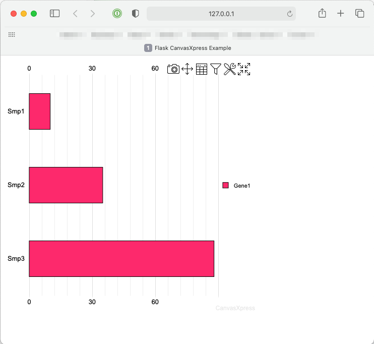
Upon running the example the following chart will be displayed on systems such as MacOS X, Windows, and Linux with graphical systems:
A Shiny for Python Example
Shiny for Python is a new dashboard framework inspired by the highly successful Shiny for R framework produced by Posit (formerly RStudio). This example shows how to create a basic Shiny for Python application using a CanvasXpress Shiny element.
Click to read more
A basic Shiny for Python app provides a means by which:
- A local development server can be started
- A function can respond to input or draw an initial UI
First install Shiny for Python and CanvasXpress for Python:
pip install shiny
pip install canvasxpress[shiny]
Then create a demo file, such as app.py, and insert:
from random import random

from shiny import App, ui, render, reactive

from canvasxpress.canvas import CanvasXpress
from canvasxpress.render.shiny import output_canvasxpress
from canvasxpress.plot import graph

app_ui = ui.page_fluid(
    ui.row(
        ui.input_slider(
            "points_desired",
            "Points",
            min=0,
            max=100,
            value=0,
        ),
    ),
    ui.row(
        output_canvasxpress("chart_view"),
    )
)


def server(input, output, session):
    @render.ui
    @reactive.event(input.points_desired)
    def chart_view():
        return graph(
            CanvasXpress(
                data={
                    "y": {
                        "data": [
                            [random() % 100 for i in range(input.points_desired())]
                        ],
                        "vars": ["A"],
                    }
                },
                config={
                    "background": "rgb(255,255,255)",
                    "colorScheme": "CanvasXpress",
                    "graphOrientation": "vertical",
                    "graphType": "Area",
                    "objectBorderColor": False,
                    "plotBox": False,
                    "plotBoxColor": "rgb(204,204,204)",
                    "showLegend": False,
                    "showLegendBorder": True,
                    "smpLabelRotate": 90,
                    "smpTitle": "time",
                    "xAxis": ["A"],
                    "xAxisTickRightShow": False,
                    "yAxisTickTopShow": False
                },
                width=500,
                height=500
            )
        )


app = App(app_ui, server)
Run the App and View the Page
On the command line, execute:
shiny run --reload --launch-browser app.py
And output similar to the following will be provided:
Uvicorn running on http://127.0.0.1:8000 (Press CTRL+C to quit)
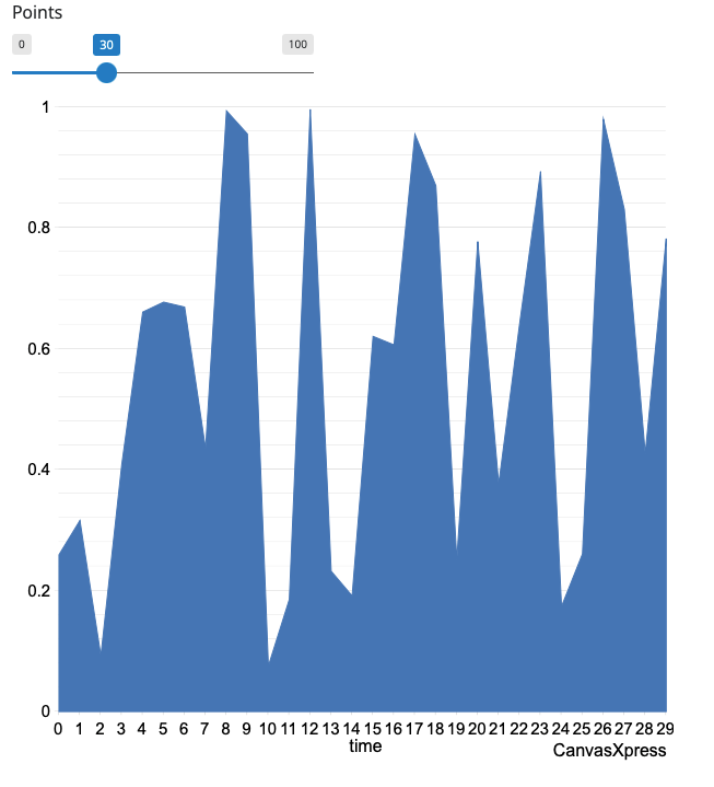
Browsing to http://localhost:8000/ will result in a page with a CanvasXpress chart, which is being hosted by the Shiny
for Python framework:
Congratulations! You have created a Shiny for Python CanvasXpress app!
A Streamlit Example
Streamlit is a popular dashboard framework that is simplified compared to Dash and Shiny, but just as powerful in terms of reactivity and extensions. This example shows how to create a basic Streamlit application using a CanvasXpress Streamlit element.
Click to read more
A basic Streamlit app provides a means by which:
- A local development server can be started
- A function can respond to a URL
First install Streamlit and CanvasXpress for Python:
pip install streamlit
pip install canvasxpress[streamlit]
Then create a demo file, such as app.py, and insert:
import random

import streamlit as st

from canvasxpress.canvas import CanvasXpress
from canvasxpress.plot import graph

# A basic bar chart.  It's anonymous, so no render_to.  Data is added during the draw phase.
bar_chart = CanvasXpress(
    config={
        "graphOrientation": "vertical",
        "plotBox": True,
        "showLegend": False,
        "smpLabelRotate": 90,
        "smpTitle": "Samples",
        "theme": "CanvasXpress",
        "title": "Bar Graph Title",
        "xAxis": ["V1"],
        "xAxisTitle": "Value",
        "graphType": "Bar"
    },
    width=500,
    height=500
)

# Write the UI to the browser
# This code will be re-executed with each click of the button

# Name the theme
st.title('CanvasXpress in Streamlit!')

# Some columns to organize the button and chart
column1, column2 = st.columns([1, 3])

# A column with our data generator button
with column1:
    # This has no associated action, so by default it triggers a redraw of the UI.
    st.button("Generate New Data")

# Another column with the chart displayed
# With each redraw generate new random values
bar_chart.data = {
    "y": {
        "vars": ["V1"],
        "smps": ["S1", "S2", "S3"],
        "data": [
            [
                random.randint(100, 10000),
                random.randint(100, 10000),
                random.randint(100, 10000),
            ]
        ]
    }
}
with column2:
    # This plots the CanvasXpress chart into the UI.
    graph(bar_chart)
Run the App and View the Page
On the command line, execute:
streamlit run app.py
And output similar to the following will be provided:
Running on http://localhost:8501/ (Press CTRL+C to quit)
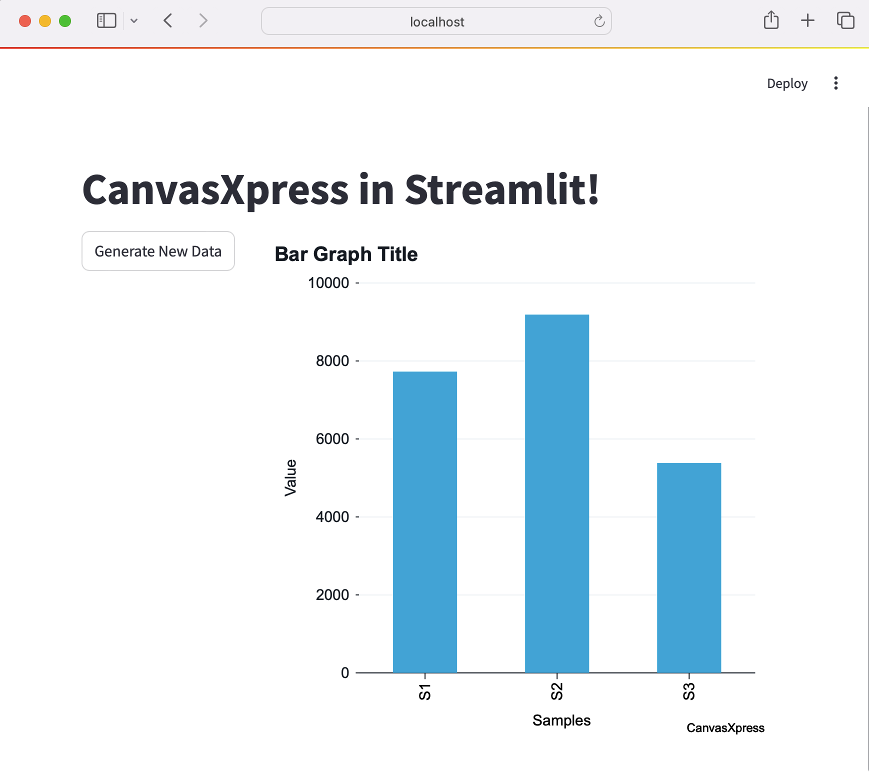
Browsing to http://localhost:8501/ will result in a page with a CanvasXpress chart, which is being hosted by the
Streamlit framework:
Congratulations! You have created a Streamlit CanvasXpress app!
A Dash Example
Plotly Dash is a popular dashboard framework similar to Shiny for Python or R. Dash applications are Web pages with widgets and elements facilitating the interactive presentation of information. This example shows how to create a basic Dash application using a CanvasXpress Dash element.
Click to read more
Create a Basic Dash App
A basic Dash app provides a means by which:
- A local development server can be started
- A function can respond to a URL
First install Dash and CanvasXpress for Python:
pip install dash
pip install canvasxpress[dash]
Then create a demo file, such as app.py, and insert:
from random import random

from dash import Dash, html

from canvasxpress.canvas import CanvasXpress
from canvasxpress.plot import graph

g_app = Dash(__name__)

colors = {
    "background": "#111111",
    "text": "rgb(127,219,255)",
}

# Application
g_app.layout = html.Div(
    style={"backgroundColor": colors["background"]},
    children=[
        html.H1(
            children="Hello Dash",
            style={"textAlign": "center", "color": colors["text"]},
        ),
        html.H2(
            children=(
                "An Example of CanvasXpress Chart in Plotly Dash"
            ),
            style={"textAlign": "center", "color": colors["text"]},
        ),
        html.Div(
            id="chart-container",
            children=[
                html.Div(
                    id="cx-container",
                    style={"textAlign": "center"},
                    children=graph(
                        CanvasXpress(
                            data={
                                "y": {
                                    "data": [
                                        [random() % 100 for i in range(5)]
                                    ],
                                    "vars": ["A"],
                                }
                            },
                            config={
                                "background": "rgb(255,255,255)",
                                "colorScheme": "CanvasXpress",
                                "graphOrientation": "vertical",
                                "graphType": "Area",
                                "objectBorderColor": False,
                                "plotBox": False,
                                "plotBoxColor": "rgb(204,204,204)",
                                "showLegend": False,
                                "showLegendBorder": True,
                                "smpLabelRotate": 90,
                                "smpTitle": "time",
                                "xAxis": ["A"],
                                "xAxisTickRightShow": False,
                                "yAxisTickTopShow": False
                            },
                            width=500,
                            height=500
                        )
                    ),
                ),
            ],
        ),
    ],
)

if __name__ == "__main__":
    g_app.run_server(debug=True)
Run the App and View the Page
On the command line, execute:
python3 app.py
And output similar to the following will be provided:
Running on http://127.0.0.1:8050/ (Press CTRL+C to quit)
Browsing to http://127.0.0.1:8050/ will result in a page with a CanvasXpress chart, which is being hosted by the Dash
framework:
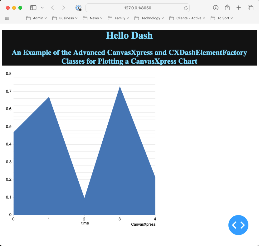
Congratulations! You have created a Plotly Dash CanvasXpress app!
A Flask Example
Flask is a popular lean Web development framework for Python based applications. Flask applications can serve Web pages, RESTful APIs, and similar backend service concepts. This example shows how to create a basic Flask application that provides a basic Web page with a CanvasXpress chart composed using Python in the backend.
The concepts in this example equally apply to other frameworks that can serve Web pages, such as Django and Tornado.
Click to read more
Create a Basic Flask App
A basic Flask app provides a means by which:
- A local development server can be started
- A function can respond to a URL
First install Flask and CanvasXpress for Python:
pip install -U Flask canvasxpress
Then create a demo file, such as app.py, and insert:
# save this as app.py
from flask import Flask

app = Flask(__name__)


@app.route('/')
def canvasxpress_example():
    return "Hello!"
On the command line, execute:
flask run
And output similar to the following will be provided:
Running on http://127.0.0.1:5000/ (Press CTRL+C to quit)
Browsing to http://127.0.0.1:5000/ will result in a page with the text
Hello!.
Add a Chart
CanvasXpress for Python can be used to define a chart with various attributes and then generate the necessary HTML and Javascript for proper display in the browser.
Add a templates directory to the same location as the app.py file, and inside add a file
called canvasxpress_example.html. Inside the file add:
<html>
<head>
    <meta charset="UTF-8">
    <title>Flask CanvasXpress Example</title>

    <!-- 2. Include the CanvasXpress library -->
    <link
            href='https://www.canvasxpress.org/dist/canvasXpress.css'
            rel='stylesheet'
            type='text/css'
    />
    <script
            src='https://www.canvasxpress.org/dist/canvasXpress.min.js'
            type='text/javascript'>
    </script>

    <!-- 3. Include script to initialize object -->
    <script type="text/javascript">
        onReady(function () {
            {
                {
                    canvas_source | safe
                }
            }
        })
    </script>

</head>
<body>

<!-- 1. DOM element where the visualization will be displayed -->
{{canvas_element|safe}}

</body>
</html>
The HTML file, which uses Jinja syntax achieves three things:
- Provides a location for a
<div>element that marks where the chart will be placed. - References the CanvasXpress CSS and JS files needed to illustrate and operate the charts.
- Provides a location for the Javascript that will replace the chart
<div>with a working element on page load.
Going back to our Flask app, we can add a basic chart definition with some data to our example function:
from flask import Flask, render_template
from canvasxpress.canvas import CanvasXpress

app = Flask(__name__)


@app.route('/')
def canvasxpress_example():
    # Define a CX bar chart with some basic data
    chart: CanvasXpress = CanvasXpress(
        data={
            "y": {
                "vars": ["Gene1"],
                "smps": ["Smp1", "Smp2", "Smp3"],
                "data": [[10, 35, 88]]
            }
        },
        config={
            "graphType": "Bar"
        }
    )

    # Get the HTML parts for use in our Web page:
    html_parts: dict = chart.render_to_html_parts()

    # Return a Web page based on canvasxpress_example.html and our HTML parts
    return render_template(
        "canvasxpress_example.html",
        canvas_element=html_parts["cx_canvas"],
        canvas_source=html_parts["cx_js"]
    )
Run the App and View the Page
Rerun the flask app on the command line and browse to the indicated IP and URL. A page similar to the following will be displayed:
Congratulations! You have created a Flask CanvasXpress app!
1 maintainer

Metadata
1 maintainer
Release files for canvasxpress 2026.9.14.70120
For a detailed explanation of source distributions (sdists) and built distributions (wheels), please see the package formats documentation.
Source distribution (sdist)
| File | Size | Uploaded | |
|---|---|---|---|
| canvasxpress-2026.9.14.70120.tar.gz | 1.2 MB | Details |
Release files / canvasxpress-2026.9.14.70120.tar.gz
| Download URL | canvasxpress-2026.9.14.70120.tar.gz |
|---|---|
| Size | 1.2 MB |
| Tags | Source |
|
SHA-256 checksum How to use checksums |
08401bb1810f7cfd813fb760f587d4a88ff14b5747897da379a05c0bc4227627
|
|
BLAKE2b-256 checksum How to use checksums |
a8c6bf92bf5d3f92649faf2b6c0ed6c8a63406b9f49c8ba82fea0234e346947e
|
| Upload date | |
|
Uploaded using Trusted Publishing? What is trusted publishing? |
No |
| Uploaded via |
twine/7.0.0 CPython/3.10.12
|














