Clean Charts



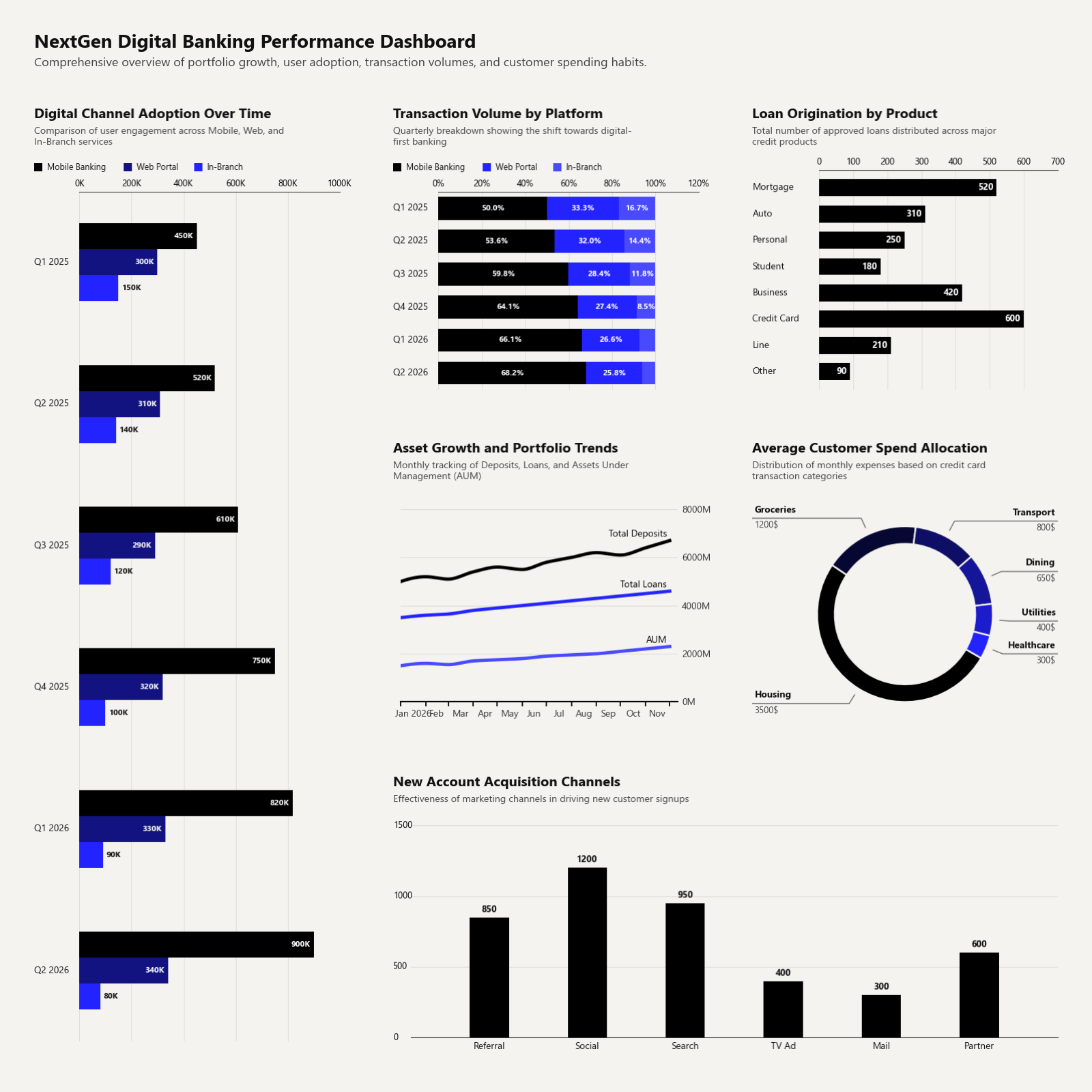
Clean Charts is a lightweight Python library for creating beautiful, publication-quality data visualizations inspired by modern editorial styles like The Economist. Go from raw data to presentation-ready charts in a single function call — no styling boilerplate required.
Table of Contents
- ✨ Highlights
- 📦 Installation
- 🚀 Quick Start
- 🎨 Customizing Data & Advanced Usage
- 📖 API Reference
- 🎛️ Global Customization
- 🧪 Examples & Development
- 📄 License
✨ Highlights
| Feature | Details |
|---|---|
| Publication-ready aesthetics | Cream-gray backgrounds, minimal gridlines, elegant sans-serif typography (natively bundled Inter font), and consistent padding — out of the box. |
| Jupyter-first workflow | Set output_path=None (the default) and charts render inline instantly. |
| Twelve chart types | Time-series lines, horizontal bars, vertical bars, grouped bars, stacked bars, donut charts, waffle charts, bubble matrices, insight cards, data tables, geofacet maps, dumbbell charts, and multi-chart dashboards. |
| Spark & Polars Support | Pass pyspark.sql.DataFrame or polars.DataFrame directly to any chart without explicit conversions. |
| Smart defaults | Auto date parsing, PCHIP spline smoothing, overlap-free label placement, and adaptive scaling for any canvas size. |
| One-line theming | Override a handful of config variables to restyle every chart in your notebook at once. |
📦 Installation
pip install clean-charts
Dependencies (installed automatically): matplotlib ≥ 3.5, pandas ≥ 1.3, numpy ≥ 1.20, Pillow ≥ 8.0, scipy ≥ 1.7.
🚀 Quick Start
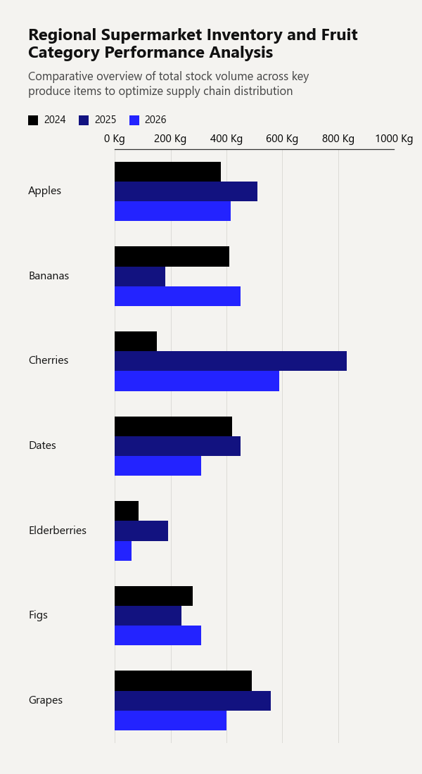
1. Grouped Horizontal Bar Chart
Display multiple numeric series side-by-side for each category, with an automatic color gradient and legend.
import pandas as pd
from clean_charts import plot_grouped_barh_chart

df = pd.DataFrame({
    'Fruit': ['Apples', 'Bananas', 'Cherries', 'Dates', 'Elderberries', 'Figs', 'Grapes'],
    '2024': [380, 410, 150, 420, 85,  280, 490],
    '2025': [510, 180, 830, 450, 190, 240, 560],
    '2026': [415, 450, 590, 310, 60,  310, 400]
})

plot_grouped_barh_chart(
    data = df,
    title="Regional Supermarket Inventory and Fruit Category Performance Analysis",
    subtitle="Comparative overview of total stock volume across key produce items to optimize supply chain distribution",
    bar_padding=0,
    group_padding=0.3,
    value_suffix = ' Kg'
)
Output:
2. Horizontal Bar Chart
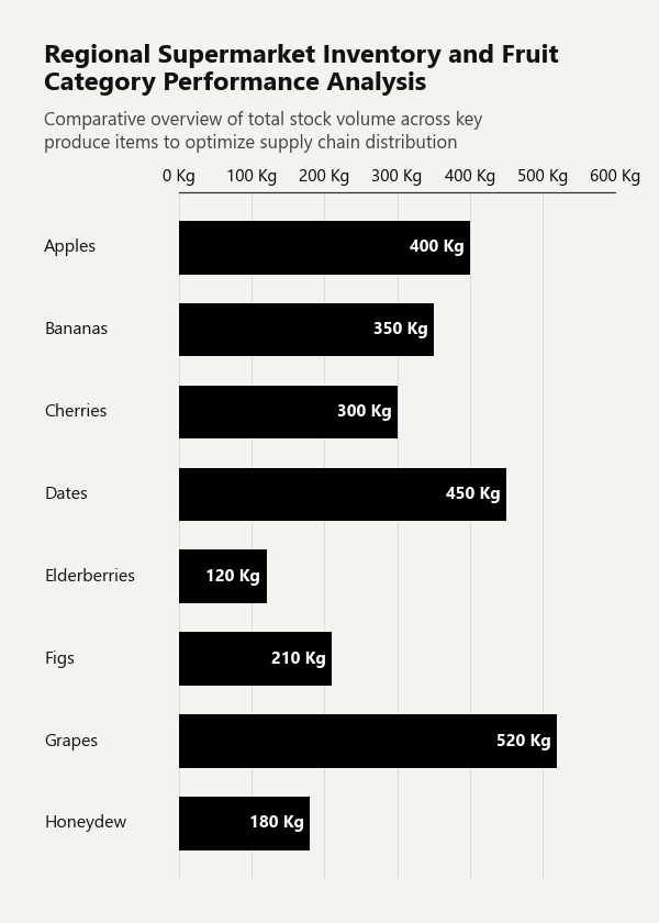
Draw a single-series horizontal bar chart with category labels and value annotations.
import pandas as pd
from clean_charts import plot_barh_chart

df = pd.DataFrame({
    'Category': ['Apples', 'Bananas', 'Cherries', 'Dates', 'Elderberries', 'Figs', 'Grapes', 'Honeydew'],
    'Sales':    [400, 350, 300, 450, 120, 210, 520, 180],
})

plot_barh_chart(
    data=df,
    title="Regional Supermarket Inventory and Fruit Category Performance Analysis",
    subtitle="Comparative overview of total stock volume across key produce items to optimize supply chain distribution",
    value_suffix=' Kg',
)
Output:
3. Time-Series Line Chart
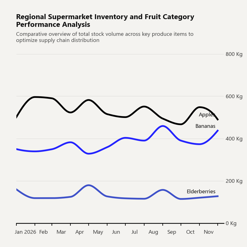
Generate a time-series line chart with smooth PCHIP spline curves, right-aligned Y-axis, and smart inline labels.
import pandas as pd
from clean_charts import plot_time_series

df = pd.DataFrame({
    'Dates': pd.date_range("2026-01-01", periods=12, freq="MS"),
    'Apples': [500, 596, 590, 523, 582, 515, 501, 551, 494, 467, 548, 490],
    'Bananas': [350, 339, 349, 200, 328, 359, 403, 390, 459, 390, 373, 437],
    'Elderberries': [160, 118, 118, 124, 179, 126, 117, 115, 157, 114, 120, 127]
})

plot_time_series(
    data=df,
    aspect_ratio='1:1',
    title="Regional Supermarket Inventory and Fruit Category Performance Analysis",
    subtitle="Comparative overview of total stock volume across key produce items to optimize supply chain distribution",
    label_frequency="month",
    line_labels='name',
    value_suffix=' Kg',
    vlines={"date": "2026-06-15", "color": "#000000", "label": "Policy Change"},
    callouts={"date": "2026-04-01",
              "series": "Bananas",
              "text": "Loss in harvest\ndue to pests"}
)
Output:
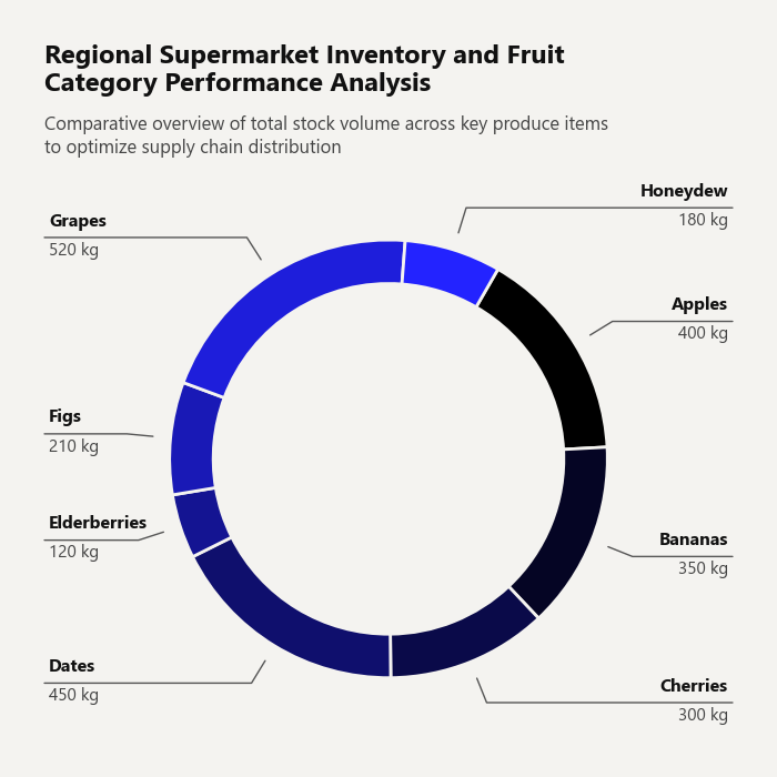
4. Donut Chart
Draw a stylized donut chart with automatic label placement that avoids overlaps.
import pandas as pd
from clean_charts import plot_donut_chart

df = pd.DataFrame({
    'Category': ['Apples', 'Bananas', 'Cherries', 'Dates', 'Elderberries', 'Figs', 'Grapes', 'Honeydew'],
    'Sales': [400, 350, 300, 450, 120, 210, 520, 180]
})

plot_donut_chart(
    data=df,
    title="Regional Supermarket Inventory and Fruit Category Performance Analysis",
    subtitle="Comparative overview of total stock volume across key produce items to optimize supply chain distribution",
    value_suffix=' kg',
    start_angle=60,
)
Output:
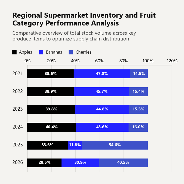
5. Stacked Horizontal Bar Chart
Visualize part-to-whole relationships across categories. Supports raw values or 100 % stacked mode.
import pandas as pd
from clean_charts import plot_stacked_bar_chart

df = pd.DataFrame({
    'Year': ['2021', '2022', '2023', '2024', '2025', '2026'],
    'Apples': [320, 340, 360, 380, 510, 415],
    'Bananas': [390, 400, 405, 410, 180, 450],
    'Cherries': [120, 135, 140, 150, 830, 590]
})

plot_stacked_bar_chart(
    data = df,
    title="Regional Supermarket Inventory and Fruit Category Performance Analysis",
    subtitle="Comparative overview of total stock volume across key produce items to optimize supply chain distribution",
    bar_padding=0.5,
    value_suffix=' Kg',
    show_percentages=True,
    bar_labels='value',
    aspect_ratio='1:1',
    scale_text=False
)
Output:
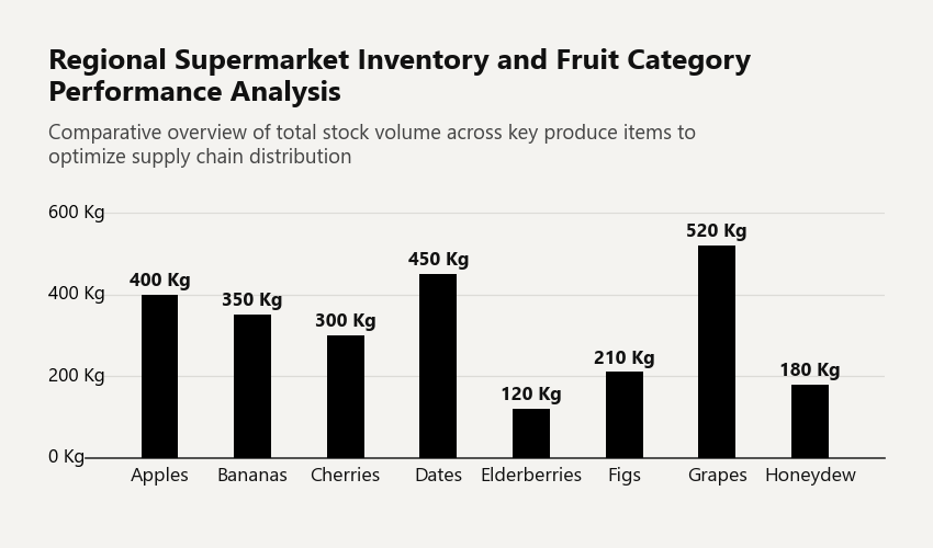
6. Vertical Bar Chart
Draw a single-series vertical bar chart with category labels along the X-axis and value annotations above each bar.
import pandas as pd
from clean_charts import plot_barv_chart

df = pd.DataFrame({
    'Category': ['Apples', 'Bananas', 'Cherries', 'Dates', 'Elderberries', 'Figs', 'Grapes', 'Honeydew'],
    'Sales': [400, 350, 300, 450, 120, 210, 520, 180]
})

plot_barv_chart(
    data=df,
    width=850,
    height=500,
    title="Regional Supermarket Inventory and Fruit Category Performance Analysis",
    subtitle="Comparative overview of total stock volume across key produce items to optimize supply chain distribution",
    value_suffix=' Kg',
    bar_padding=0.6
)
Output:
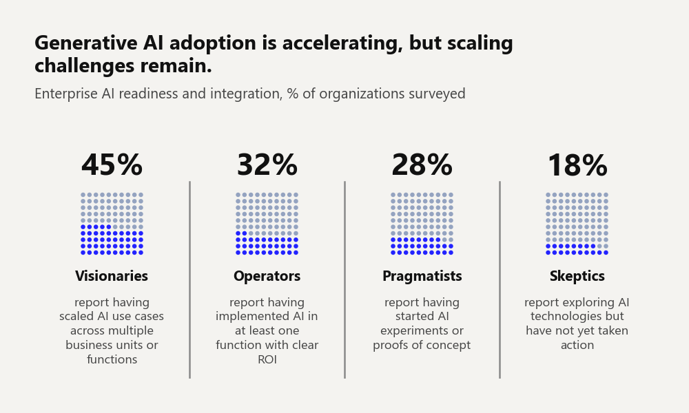
7. Waffle Chart
Visualize survey-style percentage data as 10×10 dot grids — one grid per category. Each filled dot represents 1 percentage point. Long descriptions auto-wrap and the grid scales dynamically to prevent text truncation.
import pandas as pd
from clean_charts import plot_waffle_chart

data = pd.DataFrame({
    "Label": ["Visionaries", "Operators", "Pragmatists", "Skeptics"],
    "Description": [
        "report having scaled AI use cases across multiple business units or functions",
        "report having implemented AI in at least one function with clear ROI",
        "report having started AI experiments or proofs of concept",
        "report exploring AI technologies but have not yet taken action"
    ],
    "Value": [45, 32, 28, 18]
})

plot_waffle_chart(
    data=data,
    width=1000,
    height=600,
    title='Generative AI adoption is accelerating, but scaling challenges remain.',
    subtitle='Enterprise AI readiness and integration, % of organizations surveyed',
)
Output:
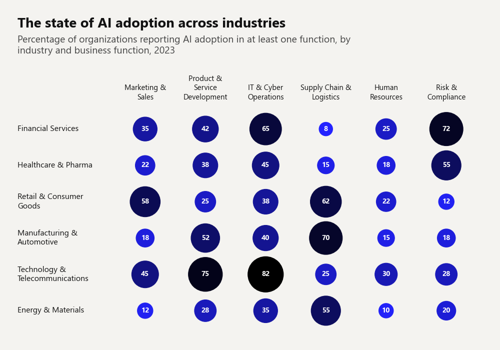
8. Bubble Matrix Chart
Encode multi-dimensional categorical data using bubble sizes (for volume) and colors (for impact or scale), automatically laid out in a clean matrix.
import pandas as pd
from clean_charts import plot_bubble_matrix_chart

data = pd.DataFrame({
    "Industry": [
        "Financial Services",
        "Healthcare & Pharma",
        "Retail & Consumer Goods",
        "Manufacturing & Automotive",
        "Technology & Telecommunications",
        "Energy & Materials"
    ],
    "Marketing & Sales": [35, 22, 58, 18, 45, 12],
    "Product & Service Development": [42, 38, 25, 52, 75, 28],
    "IT & Cyber Operations": [65, 45, 38, 40, 82, 35],
    "Supply Chain & Logistics": [8, 15, 62, 70, 25, 55],
    "Human Resources": [25, 18, 22, 15, 30, 10],
    "Risk & Compliance": [72, 55, 12, 18, 28, 20]
})

title = "The state of AI adoption across industries"
subtitle = "Percentage of organizations reporting AI adoption in at least one function, by industry and business function, 2023"

plot_bubble_matrix_chart(
    data,
    width=1000,
    height=700,
    title=title,
    subtitle=subtitle
)
Output:
9. Insight Card
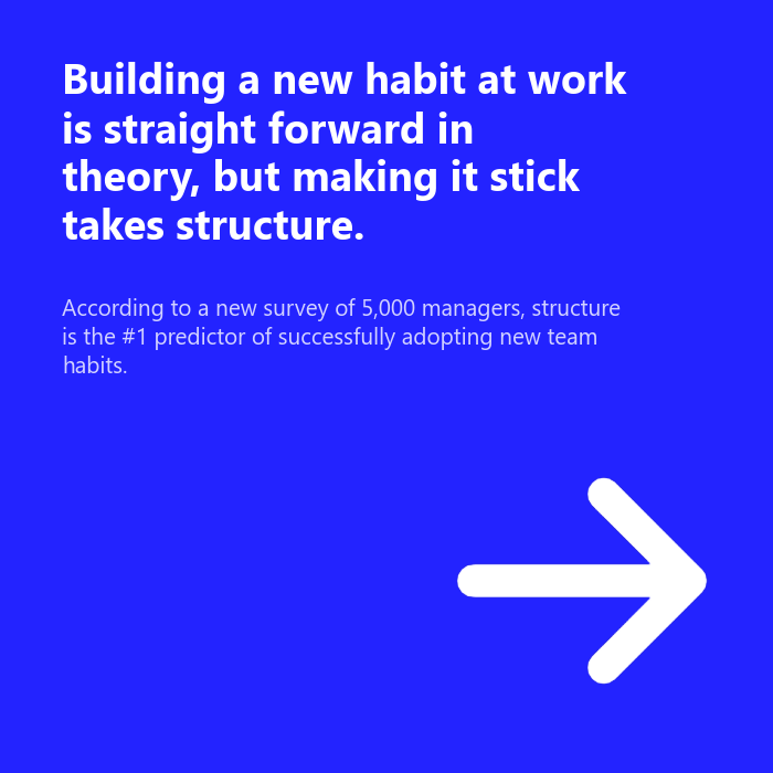
Create a bold, solid-color card with large typographic text, optional subtext, and an optional image — ideal for callout quotes, key findings, or section dividers in dashboards.
from clean_charts import plot_insight_card

plot_insight_card(
    text="Building a new habit at work is straight forward in theory, but making it stick takes structure.",
    subtext="According to a new survey of 5,000 managers, structure is the #1 predictor of successfully adopting new team habits.",
    image_path="Images/right.png",
    aspect_ratio='1:1',
)
Output:
10. Data Table
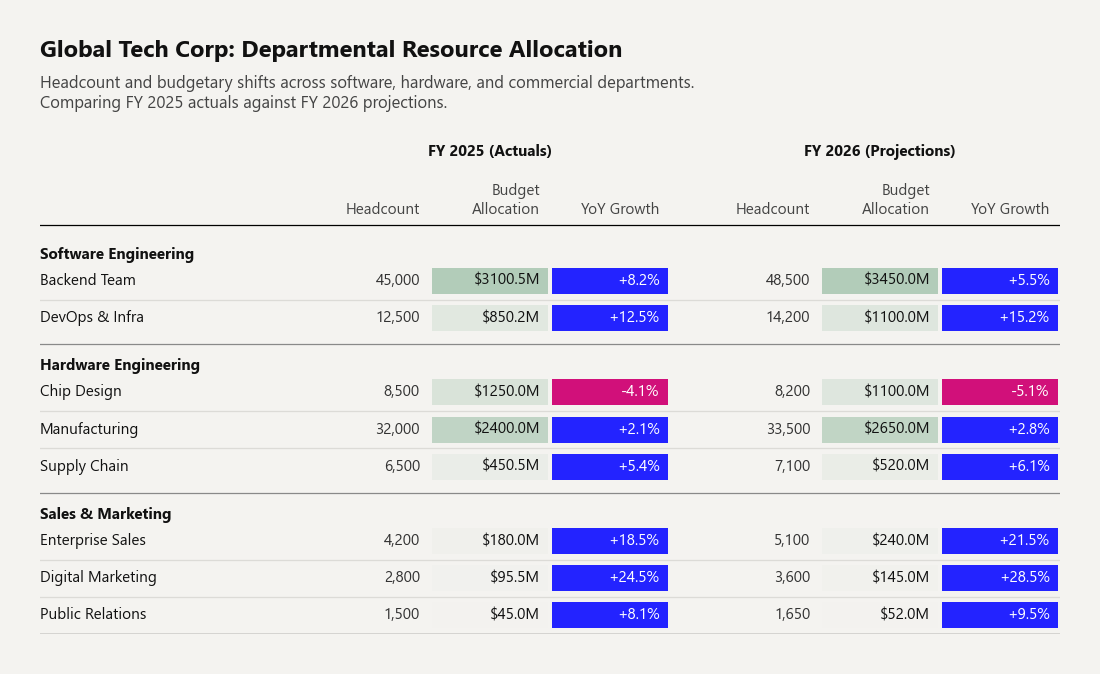
Generate highly customizable, publication-quality data tables with automated text wrapping, row/column multi-indexes, configurable alignment, and dynamic conditional formatting (e.g. pills, heatmaps).
import pandas as pd
from clean_charts import plot_table

# 1. Dataset
df_tech = pd.DataFrame(
    [
        [45000, 3100.5, 0.082, 48500, 3450.0, 0.055],
        [12500, 850.2, 0.125, 14200, 1100.0, 0.152],

        [8500,  1250.0, -0.041, 8200, 1100.0, -0.051],
        [32000, 2400.0, 0.021, 33500, 2650.0, 0.028],
        [6500,  450.5, 0.054, 7100, 520.0, 0.061],

        [4200,  180.0, 0.185, 5100, 240.0, 0.215],
        [2800,  95.5, 0.245, 3600, 145.0, 0.285],
        [1500,  45.0, 0.081, 1650, 52.0, 0.095],
    ],
    index=pd.MultiIndex.from_tuples([
        ('Software Engineering', 'Backend Team'),
        ('Software Engineering', 'DevOps & Infra'),

        ('Hardware Engineering', 'Chip Design'),
        ('Hardware Engineering', 'Manufacturing'),
        ('Hardware Engineering', 'Supply Chain'),

        ('Sales & Marketing', 'Enterprise Sales'),
        ('Sales & Marketing', 'Digital Marketing'),
        ('Sales & Marketing', 'Public Relations'),
    ], names=['Department', 'Division']),
    columns=pd.MultiIndex.from_product([
        ['FY 2025 (Actuals)', 'FY 2026 (Projections)'],
        ['Headcount', 'Budget Allocation', 'YoY Growth']
    ], names=['Fiscal Year', 'Metrics'])
)

# 2. Table Configuration
col_format = [
    {"format": "{:,.0f}", "align": "right", "header_align": "right"},    # Headcount (No highlights)
    {"format": "${:.1f}M", "align": "right", "header_align": "right"},   # Budget
    {"format": "{:+.1%}", "align": "right", "header_align": "right"}     # YoY Growth
]

# 3. Generate the Plot
plot_table(
    data=df_tech,
    title="Global Tech Corp: Departmental Resource Allocation",
    subtitle="Headcount and budgetary shifts across software, hardware, and commercial departments.\nComparing FY 2025 actuals against FY 2026 projections.",
    columns=col_format * 2,
    highlightRules=[
        # Heatmap for Budget Allocation (Cols 1 & 4)
        {"col": 1, "condition": "range", "min_color": "#ffc4b2", "max_color": "#b2ccb9"},
        {"col": 4, "condition": "range", "min_color": "#ffc4b2", "max_color": "#b2ccb9"},

        # Positive/Negative for YoY Growth (Cols 2 & 5)
        {"col": 2, "condition": "positive-negative"},
        {"col": 5, "condition": "positive-negative"}
    ],
    width=1100
)
Output:
11. Geofacet Map Chart
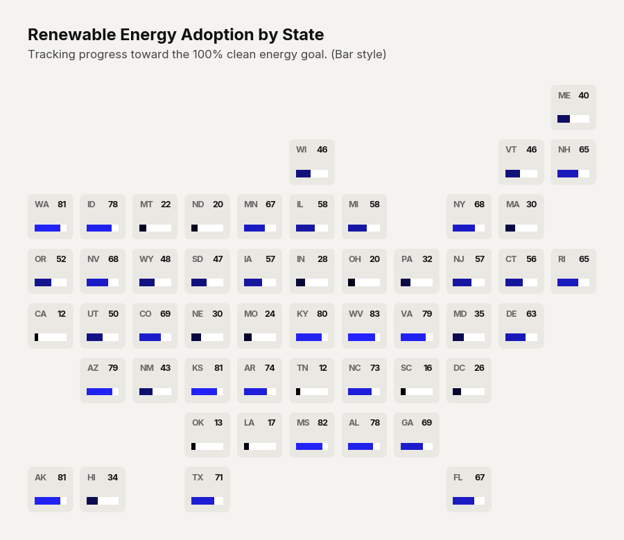
Visualize geographic data across the United States using a grid that roughly approximates the physical map. Supports three display modes: text (classic heatmap statebins), donut (progress arcs), and bar (horizontal progress bars).
import pandas as pd
import numpy as np
from clean_charts.plots import plot_geofacet

# 1. Generate data for US States
states = [
    'AL', 'AK', 'AZ', 'AR', 'CA', 'CO', 'CT', 'DE', 'FL', 'GA',
    'HI', 'ID', 'IL', 'IN', 'IA', 'KS', 'KY', 'LA', 'ME', 'MD',
    'MA', 'MI', 'MN', 'MS', 'MO', 'MT', 'NE', 'NV', 'NH', 'NJ',
    'NM', 'NY', 'NC', 'ND', 'OH', 'OK', 'OR', 'PA', 'RI', 'SC',
    'SD', 'TN', 'TX', 'UT', 'VT', 'VA', 'WA', 'WV', 'WI', 'WY', 'DC'
]

df = pd.DataFrame({
    'state': states,
    'adoption_pct': np.random.uniform(10, 85, size=len(states))
})

# 2. Render the Geofacet
plot_geofacet(
    data=df,
    display_type="bar",
    max_value=100.0,
    title="Renewable Energy Adoption by State",
    subtitle="Tracking progress toward the 100% clean energy goal. (Bar style)",
    width=900
)
Output:
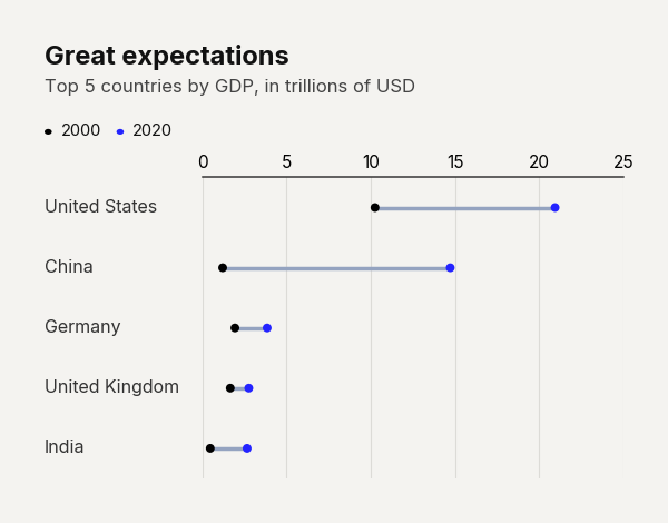
12. Dumbbell Chart
Visualize the difference between two values (e.g. start and end periods) across categories using an elegant range dot chart.
import pandas as pd
from clean_charts import plot_dumbbell_chart

df = pd.DataFrame({
    "Country": ["United States", "China", "Germany", "United Kingdom", "India"],
    "2000": [10.25, 1.21, 1.94, 1.66, 0.47],
    "2020": [20.94, 14.72, 3.85, 2.76, 2.66],
})

plot_dumbbell_chart(
    data=df,
    title="Great expectations",
    subtitle="Top 5 countries by GDP, in trillions of USD"
)
Output:
13. Dashboard (Multi-Chart Layout)
Combine any mix of chart types into a single, cohesive dashboard image using plot_dashboard. Each sub-chart is rendered independently and composited onto a unified mosaic — no manual subplot wrangling needed.
import pandas as pd
from clean_charts import (
    plot_time_series,
    plot_barh_chart,
    plot_donut_chart,
    plot_stacked_bar_chart,
    plot_dashboard,
)

# Prepare individual datasets
df_ts = pd.DataFrame({
    'Dates':   pd.date_range("2026-01-01", periods=12, freq="MS"),
    'Apples':  [500, 596, 590, 523, 582, 515, 501, 551, 494, 467, 548, 490],
    'Bananas': [350, 339, 349, 382, 328, 359, 403, 390, 459, 390, 373, 437],
})

df_bar = pd.DataFrame({
    'Category': ['Apples', 'Bananas', 'Cherries', 'Dates', 'Elderberries'],
    'Sales':    [400, 350, 300, 450, 120],
})

df_donut = pd.DataFrame({
    'Category': ['Apples', 'Bananas', 'Cherries', 'Dates'],
    'Sales':    [400, 350, 300, 450],
})

df_stacked = pd.DataFrame({
    'Year':     ['2023', '2024', '2025', '2026'],
    'Apples':   [360, 380, 510, 415],
    'Bananas':  [405, 410, 180, 450],
    'Cherries': [140, 150, 830, 590],
})

# Build the dashboard
plot_dashboard(
    charts=[
        (plot_time_series,       {"data": df_ts,      "title": "Monthly Trend"}),
        (plot_barh_chart,        {"data": df_bar,     "title": "Top Items"}),
        (plot_donut_chart,       {"data": df_donut,   "title": "Market Share"}),
        (plot_stacked_bar_chart, {"data": df_stacked, "title": "Yearly Breakdown"}),
    ],
    layout="AB\nCD",           # 2×2 grid
    title="Fruit Sales Overview — Q1 2026",
    subtitle="A consolidated view of inventory, sales trends, and category distribution",
    width=1400,
)
How it works
-
charts— A list of(plot_function, kwargs_dict)tuples. You can use any Clean Charts plot function (plot_time_series,plot_barh_chart,plot_barv_chart,plot_grouped_barh_chart,plot_donut_chart,plot_stacked_bar_chart,plot_waffle_chart,plot_bubble_matrix_chart,plot_insight_card,plot_geofacet). Do not includeoutput_pathin the kwargs — it is managed automatically. -
layout— An ASCII mosaic string where each unique letter maps to one chart in order. Use repeated letters to span cells across rows or columns:"AB\nCD" → 2×2 grid (default for 4 charts) "AA\nBC" → chart A spans the entire top row (2 columns) "AB\nAC" → chart A spans the entire left column (2 rows) "AB\nCC" → chart C spans the entire bottom row "AAB\nCDD" → 3-column layout with mixed spans "ABC" → single row, three equal columns "AA\nAA" → one chart fills the entire canvasIf omitted, charts are auto-arranged in a roughly square grid.
-
Consistent styling — All sub-charts share a unified scale factor and pixel margins, so titles, subtitles, labels, and margins align perfectly across all charts — even when charts span multiple columns or rows.
Multi-span layout example
Charts spanning 2+ columns or rows have the same title size and positioning as 1×1 charts:
# Wide chart on top, two standard charts below
plot_dashboard(
    charts=[
        (plot_time_series, {"data": df_ts, "title": "Revenue Trend", "subtitle": "24-month overview"}),
        (plot_barh_chart,  {"data": df_bar, "title": "Top Items", "subtitle": "By sales volume"}),
        (plot_donut_chart, {"data": df_donut, "title": "Market Share", "subtitle": "By category"}),
    ],
    layout="AA\nBC",
    title="Executive Summary",
    width=1400,
)
Output:
🎨 Customizing Data & Advanced Usage
Click to expand Advanced Usage
Custom Time-Series Data
Supply your own pandas.DataFrame containing a date/time column and one or more value columns. The library automatically parses the datetime column and maps all other numeric columns as lines.
import pandas as pd
from clean_charts import plot_time_series

data = pd.DataFrame({
    "Day": pd.date_range("2026-05-01", periods=10, freq="D"),
    "Active Users": [120, 150, 190, 240, 220, 250, 270, 310, 340, 320],
    "Signups":      [15,  22,  35,  40,  28,  30,  32,  45,  52,  48],
})

plot_time_series(
    data=data,
    output_path="daily_stats.png",
    title="Daily Server Growth",
    subtitle="Active users and registrations in May 2026",
    label_frequency="day",   # "year" | "quarter" | "month" | "week" | "day" | "hour" | "minute" | "second"
    start_color="#006400",   # Dark green gradient start
    end_color="#ffd700",     # Gold gradient end
    smooth=True,             # Smooth PCHIP spline curves (default True)
    markers=True,            # Show circle markers on data points
    line_labels="both",      # Show "Series: value" inline labels
    value_suffix="%",        # Append "%" to Y-axis ticks and inline labels
)
Custom Horizontal Bar Chart Data
Pass a pandas.DataFrame where the first column contains string labels and the second column contains numeric values.
import pandas as pd
from clean_charts import plot_barh_chart

df = pd.DataFrame({
    "Category":    ["Apples", "Bananas", "Cherries", "Dates", "Elderberries", "Figs", "Grapes", "Honeydew"],
    "Sales (tons)":[400,      350,       300,        450,     120,            210,    520,      180],
})

plot_barh_chart(
    data=df,
    output_path="fruit_sales.png",
    title="Fruit Performance Analysis",
    subtitle="Total sales volume by item",
    value_suffix=" t",
    color="#1f77b4",
)
Custom Grouped Bar Chart Data
Pass a DataFrame whose first column contains category labels and each subsequent column represents one series.
import pandas as pd
from clean_charts import plot_grouped_barh_chart

df = pd.DataFrame({
    "Country": ["Germany", "France", "Italy", "Spain", "Poland"],
    "BEV":     [18, 14, 8, 5, 3],
    "PHEV":    [9,  7,  5, 4, 2],
    "Hybrid":  [22, 19, 12, 9, 6],
})

plot_grouped_barh_chart(
    data=df,
    output_path="ev_by_country.png",
    title="EV Adoption by Country",
    subtitle="Share of new car sales by powertrain, %",
    value_suffix="%",
    bar_labels="value",       # "none" | "value" | "name" | "both"
    start_color="#005f73",
    end_color="#94d2bd",
)
📖 API Reference
plot_time_series()
plot_time_series
| Parameter | Type | Default | Description |
|---|---|---|---|
data |
pd.DataFrame |
None |
DataFrame with a datetime column and value series. Uses built-in sample data when None. |
output_path |
str |
None |
File path to save the image. Displays inline in Jupyter when None. |
width |
int |
1000 |
Target image width in pixels. |
height |
int |
562 |
Target image height in pixels. |
aspect_ratio |
str |
None |
"square" / "1:1", "landscape" / "2:1", "vertical" / "1:2". Overrides width/height. |
title |
str |
None |
Bold title text, left-aligned. Auto-wraps to 2 lines. |
subtitle |
str |
None |
Subtitle below the title. Auto-wraps to 2 lines. |
start_color |
str |
None |
Hex color for the first series in a gradient. |
end_color |
str |
None |
Hex color for the last series in a gradient. |
label_frequency |
str |
"year" |
X-axis tick frequency: "year", "quarter", "month", "week", "day", "hour", "minute", "second". |
markers |
bool / str |
None |
False/None = none, True = circles, or any matplotlib marker string (e.g. "s", "D"). |
line_labels |
str |
"name" |
Inline endpoint labels: "name", "value", "both", or "none". |
value_suffix |
str |
"" |
Appended to Y-axis ticks and inline value labels (e.g. "%"). |
smooth |
bool |
True |
Draw PCHIP spline curves. Falls back to straight lines if scipy is missing. |
scale_text |
bool |
False |
Scale fonts and line weights proportionally to image size. |
vlines |
str/dict/list |
None |
Vertical reference lines. Accepts a date string, a styling dict, or a list. |
highlight_ranges |
tuple/dict/list |
None |
Shaded time ranges. Accepts a date tuple, a styling dict, or a list. |
callouts |
dict/list |
None |
Point annotations. Snaps to the nearest data point and draws a dot, leader line, and text box. |
plot_barh_chart()
plot_barh_chart
| Parameter | Type | Default | Description |
|---|---|---|---|
data |
pd.DataFrame |
None |
Column 0 = category strings, column 1 = numeric values. Uses built-in survey data when None. |
output_path |
str |
None |
File path to save the image. Displays inline when None. |
width |
int |
600 |
Target image width in pixels. |
height |
int |
None |
Auto-sized by number of categories when None. |
aspect_ratio |
str |
None |
"square" / "1:1", "landscape" / "2:1", "vertical" / "1:2". |
title |
str |
None |
Bold title text. |
subtitle |
str |
None |
Subtitle below the title. |
color |
str |
"#000000" |
Hex color for the bars. |
bar_padding |
float |
0.35 |
Fraction of bar slot left as gap (0.0–1.0). |
value_suffix |
str |
"" |
Appended to value labels and axis ticks. |
scale_text |
bool |
True |
Scale fonts proportionally to image size. |
plot_dumbbell_chart()
plot_dumbbell_chart
| Parameter | Type | Default | Description |
|---|---|---|---|
data |
pd.DataFrame |
None |
Three columns: labels, start values, end values. |
output_path |
str |
None |
File path to save. Renders inline when None. |
width |
int |
600 |
Target image width in pixels. |
height |
int |
None |
Auto-sized when None. |
aspect_ratio |
str |
None |
"square" / "1:1", "landscape" / "2:1", "vertical" / "1:2". |
title |
str |
None |
Bold title text. Auto-wraps to 2 lines. |
subtitle |
str |
None |
Subtitle. Auto-wraps to 3 lines. |
bg_color |
str |
None |
Background hex color. |
start_color |
str |
None |
Start value dot color. |
end_color |
str |
None |
End value dot color. |
connector_color |
str |
None |
Connecting line color. |
dot_size |
float |
None |
Marker size (auto-scaled if None). |
value_suffix |
str |
"" |
Appended to axis tick labels and inline values. |
scale_text |
bool |
True |
Scale fonts proportionally to image size. |
show_values |
bool |
False |
Display numeric labels next to the dots. |
plot_grouped_barh_chart()
plot_grouped_barh_chart
| Parameter | Type | Default | Description |
|---|---|---|---|
data |
pd.DataFrame |
None |
Column 0 = category labels, remaining columns = numeric series. |
output_path |
str |
None |
File path to save. Displays inline when None. |
width |
int |
600 |
Target image width in pixels. |
height |
int |
None |
Auto-sized when None. |
aspect_ratio |
str |
None |
"square" / "1:1", "landscape" / "2:1", "vertical" / "1:2". |
title |
str |
None |
Bold title text. Auto-wraps to 2 lines. |
subtitle |
str |
None |
Subtitle. Auto-wraps to 3 lines. |
start_color |
str |
"#000000" |
Gradient start color. |
end_color |
str |
"#2323FF" |
Gradient end color. |
bar_padding |
float |
0 |
Whitespace fraction within a single bar slot (0–1). |
group_padding |
float |
0.45 |
Spacing fraction between groups (0–1). |
value_suffix |
str |
"" |
Appended to axis tick labels. |
bar_labels |
str |
"none" |
"none", "value", "name", or "both". |
scale_text |
bool |
True |
Scale fonts proportionally to image size. |
plot_donut_chart()
plot_donut_chart
| Parameter | Type | Default | Description |
|---|---|---|---|
data |
pd.DataFrame |
None |
Two columns: category labels and values. |
output_path |
str |
None |
File path to save. Renders inline when None. |
width |
int |
600 |
Target image width in pixels. |
height |
int |
600 |
Target image height. Defaults to width. |
aspect_ratio |
str |
None |
"square" / "1:1", "landscape" / "2:1", "vertical" / "1:2". |
title |
str |
None |
Bold title text. Auto-wraps to 2 lines. |
subtitle |
str |
None |
Subtitle. Auto-wraps to 3 lines. |
colors |
list |
DEFAULT_COLORS |
List of hex colors for slices. |
start_color |
str |
None |
Gradient start (overrides colors when paired with end_color). |
end_color |
str |
None |
Gradient end. |
donut_radius |
float |
0.4 |
Outer radius relative to figure height. |
donut_thickness |
float |
0.15 |
Ring thickness relative to figure height. |
value_suffix |
str |
"" |
Appended to value labels. |
scale_text |
bool |
True |
Scale fonts proportionally to image size. |
show_percentages |
bool |
False |
Show percentage of total instead of raw value. |
start_angle |
int |
90 |
Starting angle for the first slice (degrees). |
plot_stacked_bar_chart()
plot_stacked_bar_chart
| Parameter | Type | Default | Description |
|---|---|---|---|
data |
pd.DataFrame |
None |
Column 0 = category strings, columns 1–N = numeric series. |
output_path |
str |
None |
File path to save. Renders inline when None. |
width |
int |
600 |
Target image width in pixels. |
height |
int |
None |
Auto-sized from categories when None. |
aspect_ratio |
str |
None |
"square" / "1:1", "landscape" / "2:1", "vertical" / "1:2". |
title |
str |
None |
Bold title text. Auto-wraps to 2 lines. |
subtitle |
str |
None |
Subtitle. Auto-wraps to 3 lines. |
colors |
list |
DEFAULT_COLORS |
List of hex colors for series. |
start_color |
str |
None |
Gradient start (overrides colors when paired with end_color). |
end_color |
str |
None |
Gradient end. |
bar_padding |
float |
0.30 |
Whitespace fraction within a bar slot (0–1). |
value_suffix |
str |
"" |
Appended to axis tick labels. |
bar_labels |
str |
"none" |
"none", "value", "name", or "both". |
scale_text |
bool |
True |
Scale fonts proportionally to image size. |
show_percentages |
bool |
False |
Convert to 100 % stacked bar chart with percentage labels. |
plot_barv_chart()
plot_barv_chart
| Parameter | Type | Default | Description |
|---|---|---|---|
data |
pd.DataFrame |
None |
Column 0 = category strings, column 1 = numeric values. Uses built-in sample data when None. |
output_path |
str |
None |
File path to save the image. Displays inline when None. |
width |
int |
600 |
Target image width in pixels. |
height |
int |
None |
Auto-sized by number of categories when None. |
aspect_ratio |
str |
None |
"square" / "1:1", "landscape" / "2:1", "vertical" / "1:2". |
title |
str |
None |
Bold title text. |
subtitle |
str |
None |
Subtitle below the title. |
color |
str |
"#000000" |
Hex color for the bars. |
bar_padding |
float |
0.35 |
Fraction of bar slot left as gap (0.0–1.0). |
value_suffix |
str |
"" |
Appended to value labels and axis ticks. |
scale_text |
bool |
True |
Scale fonts proportionally to image size. |
plot_waffle_chart()
plot_waffle_chart
| Parameter | Type | Default | Description |
|---|---|---|---|
data |
pd.DataFrame |
None |
Two or three columns. If 3: Label, Description, Value. If 2: Description, Value. |
output_path |
str |
None |
File path to save. Displays inline when None. |
width |
int |
None |
Target image width in pixels. Defaults to max(800, n × 180). |
height |
int |
None |
Target image height in pixels. Defaults to 450. |
aspect_ratio |
str |
None |
"square" / "1:1", "landscape" / "2:1", "vertical" / "1:2". |
title |
str |
None |
Bold title text. |
subtitle |
str |
None |
Subtitle below the title. |
color |
str |
config.DEFAULT_COLOR_POP |
Hex color for the filled dots. |
inactive_color |
str |
config.DEFAULT_COLOR_MUTED |
Hex color for the unfilled dots. |
value_suffix |
str |
"%" |
String appended to value labels. |
scale_text |
bool |
True |
Scale fonts proportionally to image size. |
plot_bubble_matrix_chart()
plot_bubble_matrix_chart
| Parameter | Type | Default | Description |
|---|---|---|---|
data |
pd.DataFrame |
None |
Row labels in the first column, bubble size values in remaining numeric columns. |
output_path |
str |
None |
File path to save. Displays inline when None. |
width |
int |
None |
Target image width in pixels. |
height |
int |
None |
Target image height in pixels. |
aspect_ratio |
str |
None |
"square" / "1:1", "landscape" / "2:1", "vertical" / "1:2". |
title |
str |
None |
Bold title text. |
subtitle |
str |
None |
Subtitle below the title. |
bg_color |
str |
config.BACKGROUND_COLOR |
Canvas background color. |
start_color |
str |
None |
Start color for the continuous gradient interpolation. |
end_color |
str |
None |
End color for the continuous gradient interpolation. |
show_values |
bool |
True |
Display numerical text inside the bubbles. |
value_suffix |
str |
"" |
Suffix for the printed values (e.g. "%"). |
color_data |
pd.DataFrame |
None |
Optional dual-metric data. Bubbles are colored and labeled according to this dataframe, while data dictates area. |
scale_text |
bool |
True |
Scale fonts proportionally to image size. |
plot_insight_card()
plot_insight_card
| Parameter | Type | Default | Description |
|---|---|---|---|
text |
str |
(required) | The main insight or summary text to display. Auto-wraps and auto-scales to fit. |
subtext |
str |
None |
Secondary text displayed below the main text in a smaller, lighter font. |
image_path |
str |
None |
Path to a raster image (PNG/JPG) rendered at the bottom-right of the card (max 40% height). |
output_path |
str |
None |
File path to save. Displays inline when None. |
width |
int |
800 |
Target image width in pixels. |
height |
int |
450 |
Target image height in pixels. |
aspect_ratio |
str |
None |
"landscape" / "2:1", "square" / "1:1", "vertical" / "1:2", "portrait" / "3:4", "card" / "4:5". Defaults to landscape. |
bg_color |
str |
config.DEFAULT_COLOR_POP |
Hex color for the card background. |
text_color |
str |
config.DEFAULT_INVERTED_TITLE |
Hex color for text. |
font_family |
str |
"sans-serif" |
Font family for text rendering. |
scale_text |
bool |
True |
Scale fonts proportionally to image size. |
plot_dashboard()
plot_dashboard
Combine multiple charts into a single composite image using a mosaic layout. Charts that span multiple columns or rows are rendered with the same title size and margin alignment as single-cell charts.
| Parameter | Type | Default | Description |
|---|---|---|---|
charts |
list[tuple] |
(required) | List of (plot_function, kwargs_dict) pairs. Accepts any Clean Charts function (plot_time_series, plot_barh_chart, plot_barv_chart, plot_grouped_barh_chart, plot_donut_chart, plot_stacked_bar_chart, plot_waffle_chart, plot_bubble_matrix_chart, plot_insight_card). output_path is managed internally — do not include it. |
layout |
str |
None |
ASCII mosaic string (e.g. "AB\nCD"). Each unique letter maps to one chart in order of first appearance. Repeat letters to span columns/rows. Auto-generates a grid when None. |
title |
str |
None |
Dashboard title rendered above the mosaic. |
subtitle |
str |
None |
Dashboard subtitle rendered below the title. |
output_path |
str |
None |
File path to save. Displays inline when None. |
width |
int |
1400 |
Final image width in pixels. |
height |
int |
None |
Auto-derived from layout proportions and width when None. |
padding |
float |
0.02 |
Fractional space between sub-charts (0–0.5). |
Layout examples:
"AB\nCD"   →  2×2 grid (default for 4 charts)
"AA\nBC"   →  chart A spans full top row (2 columns)
"AB\nAC"   →  chart A spans full left column (2 rows)
"AB\nCC"   →  chart C spans full bottom row
"AAB\nCDD" →  3-column layout with mixed spans
"ABC"      →  single row, three equal columns
"AA\nAA"   →  one chart fills the entire canvas
Alignment note: All sub-charts automatically share a unified scale factor and pixel margins, ensuring titles, subtitles, labels, and axes are perfectly aligned across charts — even when they span different numbers of grid cells.
plot_table()
plot_table
Plots an Economist-style data table using Matplotlib primitives. Supports multiline wrapping for text, dynamic row heights, and robust conditional highlighting.
| Parameter | Type | Default | Description |
|---|---|---|---|
data |
pd.DataFrame |
None |
The tabular data to plot. Supports MultiIndex columns and rows. |
output_path |
str |
None |
File path to save the image. Displays inline when None. |
width |
int |
1000 |
Target image width in pixels. |
height |
int |
None |
Target image height in pixels. Computed dynamically if not provided. |
aspect_ratio |
str |
None |
"square" / "1:1", "landscape" / "2:1", "vertical" / "1:2". |
title |
str |
None |
Bold title text. |
subtitle |
str |
None |
Subtitle below the title. |
bg_color |
str |
config.BACKGROUND_COLOR |
Canvas background color. |
columns |
list[dict] |
[] |
List of dicts for column-specific configurations. E.g., [{"format": "${:.2f}", "align": "right", "width_pct": 0.2, "header_align": "left"}]. |
cellStyles |
dict |
{} |
Styling applied to specific cells by tuple index (r, c). E.g., {(0, 1): {"bold": True, "textColor": "#ff0000", "backgroundColor": "#eeeeee"}}. |
highlightRules |
list[dict] |
[] |
Conditional formatting rules. Pass "col" to restrict to a specific column index. Supports "condition": "positive-negative" and "condition": "range" (heatmaps). |
options |
dict |
{} |
Global table styling options: showPills, rowGroupDivider, rowGroupSpacing, columnGroupDivider, columnGroupSpacing, alternateRowHighlight, alternateRowBgColor, rowLabelWidthPct. |
scale_text |
bool |
False |
Scale fonts proportionally to image size. |
plot_geofacet()
plot_geofacet
Visualize geographic data using a grid that roughly approximates the physical map (supports US and UK layouts).
| Parameter | Type | Default | Description |
|---|---|---|---|
data |
pd.DataFrame |
(required) | DataFrame containing state abbreviations and numeric values. |
state_col |
str |
"state" (auto-detected) |
Column name containing location abbreviations (e.g. "CA", "NY", or "LON", "SCT"). |
value_col |
str |
"value" (auto-detected) |
Column name containing the numeric values to map. |
layout |
str |
"us" |
The grid layout to use. (Currently supports "us" and "uk"). |
display_type |
str |
"text" |
The style of the state cells: "text" (heatmap), "donut", or "bar". |
max_value |
float |
100.0 |
The maximum value used for scaling progress rings and bars. |
start_color |
str |
config.DEFAULT_START_COLOR |
Start color for the heatmap interpolation gradient. |
end_color |
str |
config.DEFAULT_END_COLOR |
End color for the heatmap interpolation gradient. |
output_path |
str |
None |
File path to save the image. Displays inline when None. |
width |
int |
800 |
Target image width in pixels. |
title |
str |
None |
Bold title text. |
subtitle |
str |
None |
Subtitle below the title. |
value_suffix |
str |
"" |
Suffix appended to the displayed value (e.g. "%"). |
scale_text |
bool |
True |
Scale fonts proportionally to the overall image width. |
get_default_data()
get_default_data
Returns the built-in sample dataset used when data=None is passed to chart functions.
Returns:
A pandas.DataFrame containing sample time-series data with a Date column and several value columns (Apples, Bananas, Oranges) covering monthly data from January 2020 to October 2025.
from clean_charts import get_default_data

df = get_default_data()
print(df.head())
🎛️ Global Customization
Click to expand Global Configuration
Import and modify global configuration variables to apply a consistent theme across all charts:
import clean_charts.config as config
from clean_charts import plot_time_series

# Override styling tokens before plotting
config.BACKGROUND_COLOR = "#ffffff"  # Pure white background
config.GRID_COLOR        = "#eaeaea"  # Light gridlines
config.AXIS_COLOR        = "#333333"  # Dark charcoal axes

plot_time_series(
    title="Custom White Theme",
    output_path="white_theme_chart.png"
)
Available Config Variables (clean_charts.config)
| Variable | Default | Description |
|---|---|---|
BACKGROUND_COLOR |
"#f4f3f0" |
Chart background (cream-gray). |
GRID_COLOR |
"#dcdbd7" |
Horizontal/vertical gridline color. |
LINE_SEPARATOR_COLOR |
"#898989" |
Color for separator lines between chart sections. |
AXIS_COLOR |
"#000000" |
Axis spine and tick color. |
TITLE_COLOR |
"#111111" |
Title text color. |
SUBTITLE_COLOR |
"#444444" |
Subtitle text color. |
LINE_COLOR |
"#000000" |
Default line/bar color. |
DEFAULT_INVERTED_TITLE |
"#FFFFFF" |
Text color for inverted backgrounds (e.g. insight cards). |
DEFAULT_COLOR |
"#000000" |
Fallback single-bar color. |
DEFAULT_COLOR_POP |
"#2323FF" |
Accent color for filled waffle dots and insight card backgrounds. |
DEFAULT_COLOR_MUTED |
"#94A3C0" |
Muted color for unfilled waffle dots. |
DEFAULT_START_COLOR |
"#000000" |
Gradient start for grouped bars. |
DEFAULT_END_COLOR |
"#2323FF" |
Gradient end for grouped bars. |
DEFAULT_COLORS_LIST |
['#000000', '#2323FF', ...] |
Default multi-series color palette. |
🧪 Examples & Development
Generate Sample Charts
python generate_sample.py
This produces a set of sample images showcasing different aspect ratios, gradient themes, label frequencies, and title-wrapping behavior.
Running Tests
python -m unittest tests/test_plot.py
📄 License
MIT © Raghuram Sirigiri
1 maintainer

Download files
Download the file for your platform. If you're not sure which to choose, learn more about installing packages.
Source Distribution
Built Distribution
Filter files by name, interpreter, ABI, and platform.
If you're not sure about the file name format, learn more about wheel file names.
Copy a direct link to the current filters
File details
Details for the file clean_charts-0.11.2.tar.gz.
File metadata
- Download URL: clean_charts-0.11.2.tar.gz
- Upload date:
- Size: 494.4 kB
- Tags: Source
- Uploaded using Trusted Publishing? No
- Uploaded via:
twine/6.2.0 CPython/3.11.9
File hashes
| Algorithm | Hash digest | |
|---|---|---|
| SHA256 |
23064282b72b694bbb684ef9193697fe885a7b69875a298110ba4c5034c7513a
|
|
| MD5 |
7568da0f713e1a9ae2bc0b646e70c7a6
|
|
| BLAKE2b-256 |
7c3d3616e0897cfbe6aa0c3d8ce4bbedfd09963645a1648c001fa00859f46dd9
|
File details
Details for the file clean_charts-0.11.2-py3-none-any.whl.
File metadata
- Download URL: clean_charts-0.11.2-py3-none-any.whl
- Upload date:
- Size: 494.1 kB
- Tags: Python 3
- Uploaded using Trusted Publishing? No
- Uploaded via:
twine/6.2.0 CPython/3.11.9
File hashes
| Algorithm | Hash digest | |
|---|---|---|
| SHA256 |
b5aa383241c1ab0c6e6045bbc0890fe11708f12746a67a7b2a58de14baff0f4a
|
|
| MD5 |
ddfae9b56e7583383df477e4a6a8a06e
|
|
| BLAKE2b-256 |
bb8351e763a1ad0e004f1e5bb309e40b6bd0839972dc2beb644dfef9ea368123
|