reglscatterpy


📖 Full documentation & API reference →
Interactive WebGL scatterplots for single-cell / spatial data in Python —
AnnData, MuData, SpatialData, pandas, numpy. Renders millions of points in
the browser via regl-scatterplot,
in Jupyter, JupyterLab, VS Code and Colab.
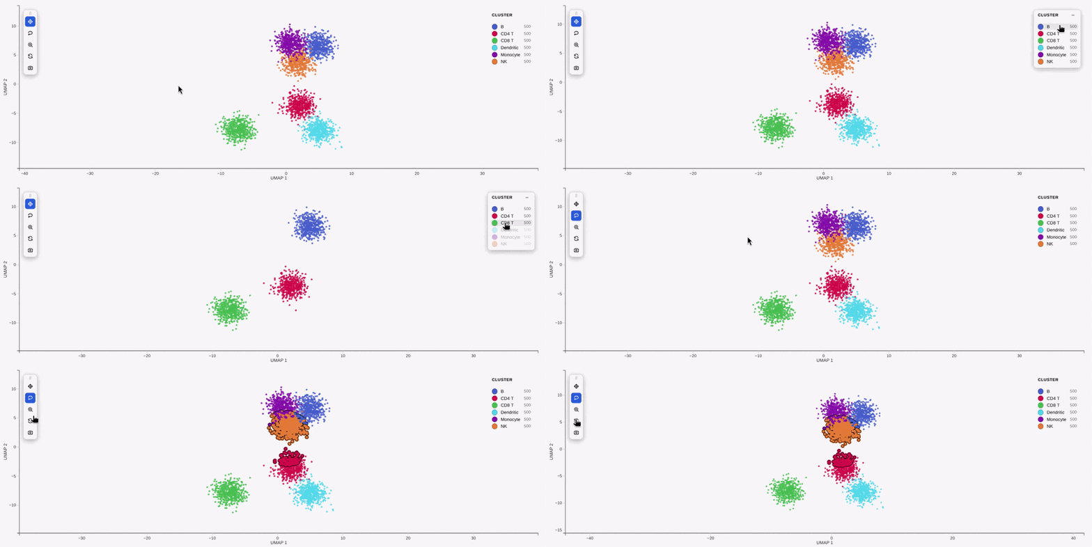
This is the Python companion to the R package
reglScatterplotR. Both
drive the same compiled widget, so a plot looks and behaves identically across
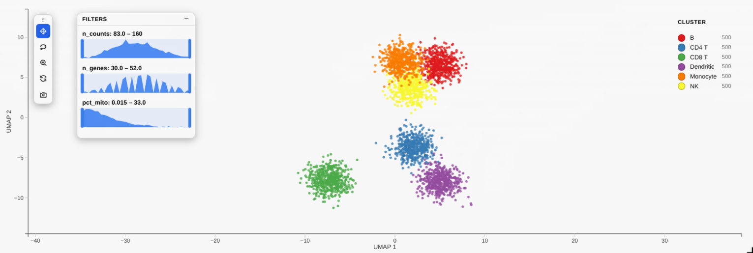
R and Python — the draggable legend, filter_by distribution sliders, lasso,
tooltips and PNG/SVG/PDF export all come from one shared codebase. (Equivalence
is locked down by tests/test_payload_parity.py, which checks the Python
payload byte-for-byte against R fixtures.)
Install
pip install reglscatterpy            # numpy, pandas, anywidget
pip install anndata                  # for AnnData; mudata / spatialdata as needed
Quick start
import scanpy as sc
import reglscatterpy as rs

adata = sc.datasets.pbmc3k_processed()
rs.scatterplot(adata, basis="umap", color_by="louvain")   # an obs column
rs.scatterplot(adata, basis="umap", color_by="CST3")      # a gene
basis= selects the embedding for single-cell objects — short names like
"umap"/"pca" resolve to the obsm key (X_umap, …), case-insensitively.
x="X_umap" still works as an alias. For a DataFrame you instead give the
coordinate columns with x=/y=:
import numpy as np, pandas as pd
df = pd.DataFrame({"x": np.random.rand(10_000), "y": np.random.rand(10_000),
                   "ct": np.random.choice(list("ABC"), 10_000)})
rs.scatterplot(df, x="x", y="y", color_by="ct")
Plots are 700 px wide by default (not the full cell width). Pass width=
(pixels) for a different size, or width=None to fill the cell.
Big data: atlas-scale rendering
By default scatterplot() keeps huge datasets interactive without silently
hiding cells, controlled by max_points (default "auto"):
# AUTO (default): caps at 500k via a density-preserving subsample.
rs.scatterplot(adata, basis="umap", color_by="cell_type")
# -> on-plot caption "500,000 of 3,900,000 shown" + a one-time warning.
The "auto" subsample uses a 2-D grid density sketch (subsample="density")
that thins dense blobs but keeps rare cell types — unlike uniform random
sampling, which drops them (subsample="random" is the uniform fallback). The
plot is always honest about it: the "X of Y shown" caption is drawn on the
figure, repr() reflects it, and an automatic downsample warns once.
w.selection still indexes the original rows.
# ALL POINTS RESIDENT (the Allen ABC-Atlas method): every cell on the GPU,
# camera-only pan/zoom. Smooth up to ~4M cells on a decent GPU.
rs.scatterplot(adata, basis="umap", color_by="cell_type", max_points=None)

rs.scatterplot(adata, basis="umap", color_by="cell_type", max_points=1_000_000)
For datasets larger than ~4M (where all-resident gets heavy), use
progressive=True — detail-on-zoom, an in-memory tiling with no preprocessing:
rs.scatterplot(adata, basis="umap", color_by="cell_type", progressive=True)
It shows a light density-sketch overview, then re-renders all cells inside the
viewport as you zoom in (a zoomed view holds few cells, so they draw at full
detail with a complete lasso). The camera domain stays fixed and the overview
snaps back instantly on zoom-out. Tune it with progressive_opts:
rs.scatterplot(adata, basis="umap", color_by="cell_type", progressive=True,
               progressive_opts={"detail_max_points": 300_000, "overscan": 0.6})
detail_max_points— max points per zoomed-in viewport (lower = smoother pan; defaults tomax_points/500k).overscan— fraction of margin fetched around the view, so panning has no hard cuts (lower = lighter pan, more visible edges; default0.6).
Rule of thumb: max_points=None for ~2–4M real atlases; progressive=True only
beyond that. progressive=True always uses the live (interactive) widget.
Gallery
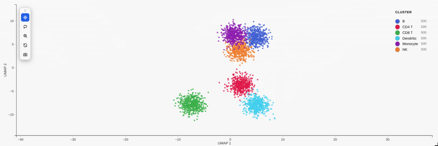
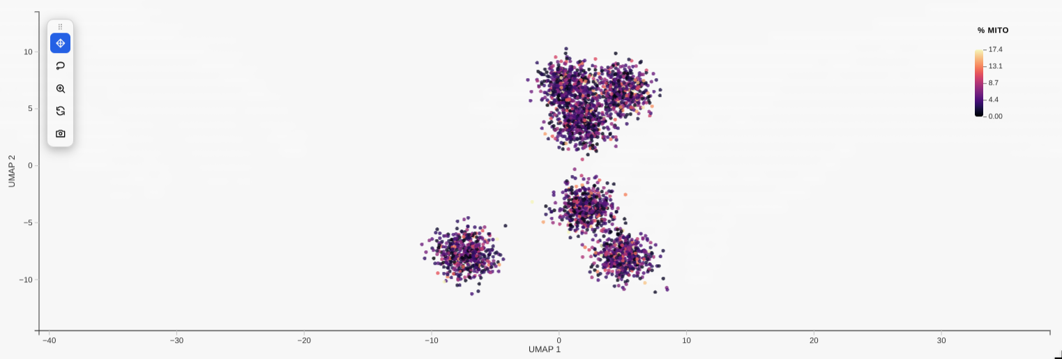
| Categorical colouring | Continuous (gene) colouring |
|---|---|
 |
 |
filter_by distribution sliders |
Linked grid (compose) |
 |
 |
Static by default, interactive on request
By default a plot renders as a self-contained snapshot (a sandboxed
<iframe> with the WebGL bundle and data baked in) — like a plotly figure, it
shows in JupyterLab, Notebook 7, VS Code and Colab, and survives reopening the
notebook with no kernel (no re-run, no blank widget-view). It stays fully
interactive visually — pan, zoom, lasso, legend, tooltips, PNG/SVG/PDF export —
but, having no kernel link, it can't send a selection back to Python.
For the Python round-trip (w.selection, annotate, diff_expression,
linked compose grids) pass interactive=True to get the live, kernel-linked
widget:
w = rs.scatterplot(adata, basis="umap", color_by="leiden", interactive=True)
w                          # lasso some cells…
adata[w.selection]         # …read them back in Python
The live widget needs a running kernel (and, like any Jupyter widget, may show blank on reopen). The static default does not — so use the default for figures you want to keep/share, and
interactive=Truewhile you're actively selecting.
Theme (light / dark / auto)
Plots are a white "figure card" by default — portable, and matching the
static/exported HTML. To make the live widget follow your notebook instead, pass
theme=:
rs.scatterplot(adata, basis="umap", color="leiden", theme="auto")   # dark card in a dark theme
rs.scatterplot(adata, basis="umap", color="leiden", theme="dark")   # always dark
"light"(default) — white card."dark"— dark card with light axes/legend."auto"(alias"system") — dark card only when the host (VS Code / JupyterLab) is in a dark theme, otherwise white.
Set it once for the whole session instead of per call:
rs.set_theme("auto")        # every subsequent plot follows the notebook theme
rs.get_theme()              # -> "auto"
A per-call theme= overrides the global, and an explicit background_color= /
axis_color= always wins over either. The theme only affects the live
widget; an exported .html stays portably light (it can't know the future
viewer's theme). In VS Code the widget also clears the editor's hard-coded white
ipywidget background around its own cell only, so the card sits cleanly on
the theme background without disturbing other widgets.
Save a standalone HTML (offline, kernel-free)
The Python equivalent of R's htmlwidgets::saveWidget: write a single
self-contained .html that inlines the widget and the plot's data, so it
opens in any browser with no kernel and no internet:
w = rs.scatterplot(adata, x="X_umap", color_by="leiden")
rs.save_html(w, "umap.html")      # or:  w.to_html("umap.html")
The saved file is fully interactive (pan/zoom, legend, lasso, tooltips,
PNG/SVG/PDF export) but it's a snapshot — it has no kernel, so the Python
round-trips (w.selection, w.annotate, …) only work in the live notebook. The
widget bundle is inlined gzip-compressed (~0.5 MB, decompressed in-browser), so
a one-plot file is well under 1 MB. No R is involved — it's pure Python.
A whole notebook → one HTML report (no re-running)
Plain jupyter nbconvert --to html leaves the plots blank (the same widget-state
limitation). The fix that avoids re-executing a heavy notebook is record
mode: call rs.record_html() once at the top, then run your notebook normally —
each plot bakes a static, interactive copy into its own cell output. After that:
import reglscatterpy as rs
rs.record_html()                 # run once near the top, then work as usual
# ... rs.scatterplot(...) cells ...
# reopening the notebook now shows the plots, and either of these makes a report
# WITHOUT re-running anything:
jupyter nbconvert --to html analysis.ipynb
reglscatterpy-report analysis.ipynb -o analysis_report.html
reglscatterpy-report (and rs.save_notebook_html(...)) default to not
re-executing — they use the recorded outputs and share one copy of the
bundle across all plots. For a notebook that wasn't recorded, pass --execute
(CLI) / execute=True to re-run it once.
rs.save_notebook_html("analysis.ipynb", "report.html")             # uses outputs
rs.save_notebook_html("analysis.ipynb", "report.html", execute=True)  # re-runs
Recorded plots are a one-way snapshot: pan/zoom/lasso/tooltips/export all work, but
w.selection/w.annotateno longer round-trip to Python (there's no kernel). Callrs.record_html(False)to go back to the live widget.
Needs nbconvert + ipykernel (pip install 'reglscatterpy[report]'). The
plots are fully offline; nbconvert's own page chrome (MathJax/RequireJS) is still
CDN-referenced — use nb_offline_convert
if you need the surrounding report shell to be 100% offline too.
Selection round-trip
Lasso points in the plot, then read them back in another cell — or drive the
selection from Python. This needs the live widget, so pass interactive=True:
w = rs.scatterplot(adata, basis="umap", color_by="leiden", interactive=True)
w                          # show it, lasso some cells in the widget

w.selection                # -> [12, 87, 134, ...]  positional indices
adata[w.selection]         # subset the AnnData directly
sub = w.subset()           # same thing, as a convenience

w.selection = list(range(100))   # or set it from Python to highlight points
Annotate cells by lassoing
Lasso a population, label it, and the label is written straight back into
adata.obs (or a DataFrame column) — curate cell types interactively:
w = rs.scatterplot(adata, basis="umap", color_by="leiden", interactive=True)
w                                  # lasso a cluster
w.annotate("cell_type", "T cells") # -> writes adata.obs["cell_type"] for those cells
# lasso another, w.annotate("cell_type", "B cells"), ... then:
rs.scatterplot(adata, x="X_umap", color_by="cell_type")
Differential expression of a selection
Lasso a population and get its top markers vs the rest (or vs another lasso):
w = rs.scatterplot(adata, basis="umap", color_by="leiden", interactive=True)
w                          # lasso a cluster
w.diff_expression(n=10)    # top genes for the selection vs all other cells
# or two saved selections:
a = w.selection            # after lassoing group A
# (lasso group B)
w.diff_expression(a, w.selection)
Or split the lasso by an obs column (e.g. condition / time) and compare its
levels — all pairwise, or a specific pair:
w                                              # lasso a region
w.diff_expression_by("condition")              # {"D30_vs_Y1": df, ...} (all pairs)
w.diff_expression_by("condition", group_a="D30", group_b="Y1")   # one pair
w.diff_expression_by("condition", group_a="Y1")                  # Y1 vs the rest
Richer tooltips
Show extra fields on hover:
rs.scatterplot(adata, x="X_umap", color_by="leiden",
               tooltip_by=["n_genes", "sample", "CST3"])   # obs cols or genes
Composition of a selection
Lasso a region and see what it's made of:
w = rs.scatterplot(adata, basis="umap", color_by="leiden", interactive=True)
w                                  # lasso a region
w.composition("leiden")            # -> count + fraction per cluster in the selection
Outlines & highlighting
Two ways to make points stand out, both using a crisp antialiased ring:
add_outline=True — a scanpy-style outline on every point (whole-plot
aesthetic). The body keeps its colour; an outer ring + background gap go behind it:
rs.scatterplot(adata, basis="umap", color_by="cluster", add_outline=True)
rs.scatterplot(adata, basis="umap", color_by="cluster", add_outline=True,
               outline_color=("black", "white"), outline_width=(0.3, 0.05))
add_outlineis for small/medium plots — it auto-skips (with a warning) above ~150k drawn points, where the ring is invisible (~1px) anyway. For huge data, mark a subset withhighlightinstead.
w.highlight([...]) — persistently mark a chosen subset of cells (live
widget). Unlike a lasso selection, it survives double-click and new lassoes:
w = rs.scatterplot(adata, basis="umap", color_by="cluster", interactive=True)
w.highlight([12, 87, 134], color="red")   # ring + size bump on these cells
w.highlight([])                            # clear
Indices are original data indices (e.g. np.where(adata.obs["cluster"]=="T")[0]).
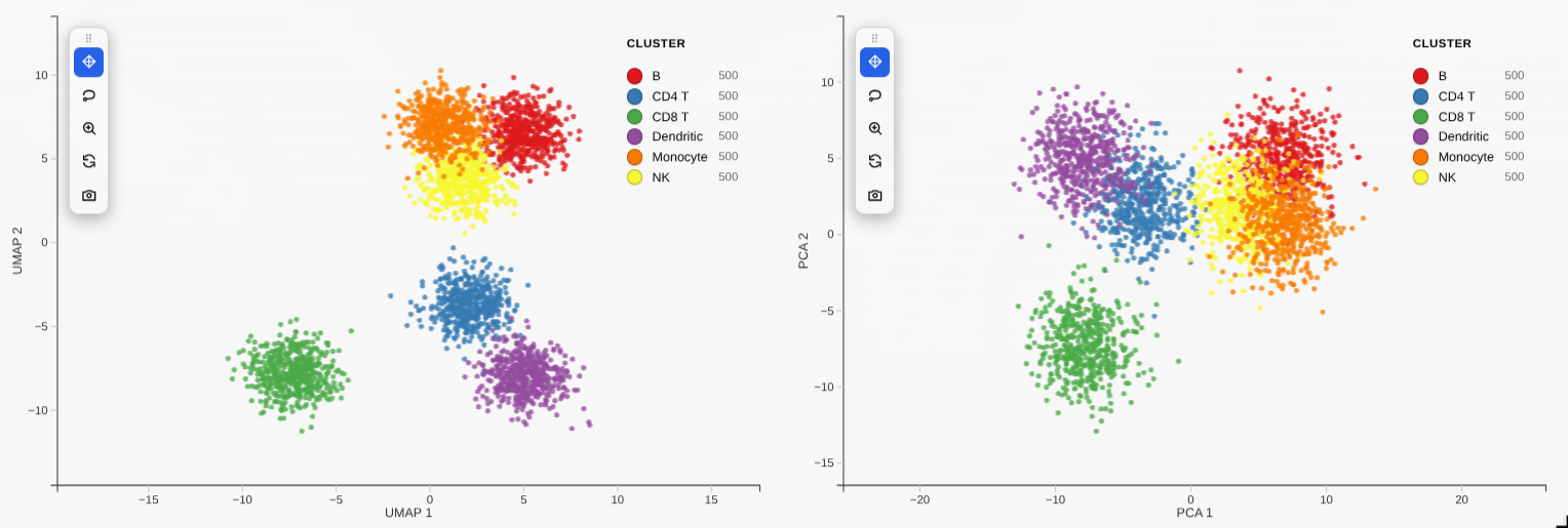
Linked grid
Colour one embedding by several genes / obs columns at once — pass a list to
color_by and you get a linked grid, one panel per value (camera + lasso stay in
sync across panels):
rs.scatterplot(adata, basis="umap", color_by=["louvain", "CST3", "NKG7"])
A list of names means "one panel per name". A raw per-point colour vector must be a numpy array / pandas Series (not a list of strings).
Or compose pre-built plots — e.g. compare different embeddings side by side.
compose() auto-upgrades plain plots to live widgets, so you don't need
interactive=True on each:
from reglscatterpy import scatterplot, compose

a = scatterplot(adata, basis="umap", color_by="leiden")
b = scatterplot(adata, basis="pca",  color_by="leiden")
compose([a, b])            # 2-up grid, linked camera + selection
A lasso or legend-category filter on one panel propagates to the others by
original cell — even across panels coloured by different variables, and even
when the panels are progressive=True (each panel fetches detail for the synced
viewport). A view reset on one panel resets the whole group.
A list of embeddings works the same way — one panel per basis, linked:
rs.scatterplot(adata, basis=["umap", "tsne", "pca"], color="leiden")
basisandcolorcan both be lists — you get the basis × colour grid (capped at 16 panels).
Animate between embeddings
On a live widget, morph_to tweens the points — and the axes — from the current
embedding to another obsm basis, so you can see how cells move between, say,
a UMAP and their spatial coordinates:
w = rs.scatterplot(adata, basis="umap", color="cell_type", interactive=True)
w                                  # shows the UMAP
w.morph_to("spatial")              # animate UMAP -> spatial layout
w.morph_to("umap", duration=800)   # and back (ms)
The active filter, legend selection, colours and lasso selection are kept
through the transition and stay recoverable if you undo them. (Atlas-scale
progressive=True plots don't morph — the point set isn't fully resident.)
Toolbar & selection extras
scatterplot(..., toolbar="left") (or "top", "none") shows an in-plot
toolbar: pan, lasso, zoom-to-selection, reset, screenshot. Pass
zoom_on_selection=True to auto-frame a lasso selection.
Encode a numeric column or a gene on point size or opacity (in
addition to colour):
scatterplot(adata, basis="umap", color_by="leiden", size_by="n_genes"),
size_by="CST3", or opacity_by="total_counts".
The categorical legend shows a per-category cell count that updates to the
filtered count while a range/legend filter is active (live for small data, on
slider-release for big data) — turn it off with legend_counts=False. Set a
global point transparency with alpha= (an alias for opacity, e.g.
alpha=0.5).
Supported objects
| Input | x (embedding) |
color_by / group_by |
|---|---|---|
AnnData |
obsm key ("X_umap", "umap", "spatial", …) |
obs column or var_names feature |
MuData |
global obsm or "modality:embedding" |
obs column or "modality:feature" |
SpatialData |
table's obsm (defaults to "spatial") |
table's obs / features |
pandas.DataFrame |
column name | column name or vector |
numpy.ndarray |
column index | vector |
API parity with R
rs.scatterplot(...) mirrors R's reglScatterplot(...): color_by / group_by,
point_size, opacity, point_color, pixel_ratio, continuous_palette /
categorical_palette, custom_colors, vmin / vmax, center_zero,
filter_by, legend styling, enable_download, and more.
A
backend="jscatter"option also exists if you'd rather render with jupyter-scatter (pip install reglscatterpy[render]); the default native widget is recommended.
The widget bundle
src/reglscatterpy/static/widget.js is a built artifact (an anywidget ESM
bundle). Its source — the shared rendering widget plus the anywidget adapter —
lives in the reglScatterplotR repo under js/. To refresh it after a JS
change, build there and copy the result here:
# from a sibling checkout of reglScatterplotR
cd reglScatterplotR/js && npm install && npm run build
cp dist/widget.js ../../reglscatterpy/src/reglscatterpy/static/widget.js
Develop / test
pip install -e .[dev]
pytest          # extraction tests skip cleanly without anndata/scipy
1 maintainer

Download files
Download the file for your platform. If you're not sure which to choose, learn more about installing packages.
Source Distribution
Built Distribution
Filter files by name, interpreter, ABI, and platform.
If you're not sure about the file name format, learn more about wheel file names.
Copy a direct link to the current filters
File details
Details for the file reglscatterpy-0.6.32.tar.gz.
File metadata
- Download URL: reglscatterpy-0.6.32.tar.gz
- Upload date:
- Size: 1.8 MB
- Tags: Source
- Uploaded using Trusted Publishing? No
- Uploaded via: twine/6.2.0 CPython/3.11.15
File hashes
| Algorithm | Hash digest | |
|---|---|---|
| SHA256 |
559a65f289d638cf19a1ed1ecae7ffc2d3100428905dfb9f65939799f0e6afd4
|
|
| MD5 |
569a10134fde612182f6f8fb09fef9f4
|
|
| BLAKE2b-256 |
ca3bb322abd6f847ea41dd0f8a352075716c24bf67673fb124fd543c6ce6e3a0
|
File details
Details for the file reglscatterpy-0.6.32-py3-none-any.whl.
File metadata
- Download URL: reglscatterpy-0.6.32-py3-none-any.whl
- Upload date:
- Size: 499.2 kB
- Tags: Python 3
- Uploaded using Trusted Publishing? No
- Uploaded via: twine/6.2.0 CPython/3.11.15
File hashes
| Algorithm | Hash digest | |
|---|---|---|
| SHA256 |
b89fec63a4481cafecad02b785a5415d0364ca1e709077ee5bb2dcf803470dcd
|
|
| MD5 |
fd7781df436ea1e6d7de23d0d29c544d
|
|
| BLAKE2b-256 |
90e7ecf09cb8357be258b5bdaad3fa2f0b131f5666caad90d51906636540a6cd
|